ARTS-3333 Class Meeting-23 | Spring 2026
Class Meeting Time for Section I (In-person):
8:00 AM – 10:40 AM, Wednesday, April 15, 2026 (Week-13)
Class Meeting Time for Section II (In-person):
4:45 PM – 7:25 PM, Wednesday, April 15, 2026 (Week-13)
Course Syllabus: https://pxstudio.us/blog/?p=79271
Project Brief-3: Large-Format Print Design & Prepress
(+Creating Toned Images for BRM Design)
https://pxstudio.us/blog/?p=80195
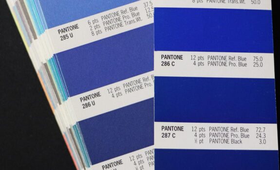
Understanding the Pantone Matching System (PMS Colors)
https://pxstudio.us/blog/?p=80543
PMS Color Presets Download
Password to open every ARTS-3333 post: 0303-sp26
What do “CMYK Coated” and “CMYK Uncoated” mean
CMYK Coated (C)
- Used for glossy or semi-gloss paper such as magazines or brochures.
- Paper has a smooth, sealed surface Ink stays on top of the paper
- Colors appear brighter, sharper, and more saturated
- Example: Fashion magazines, posters, marketing materials…etc.
CMYK Uncoated (U)
- Used for matte or textured paper (stationery, letterhead)
- Paper is porous and absorbs ink Ink soaks into the paper fibers
- Colors appear duller, softer, and less saturated
- Example: Letterheads, notebooks, business cards
What is the difference between CMYK Coated and CMYK Uncoated?
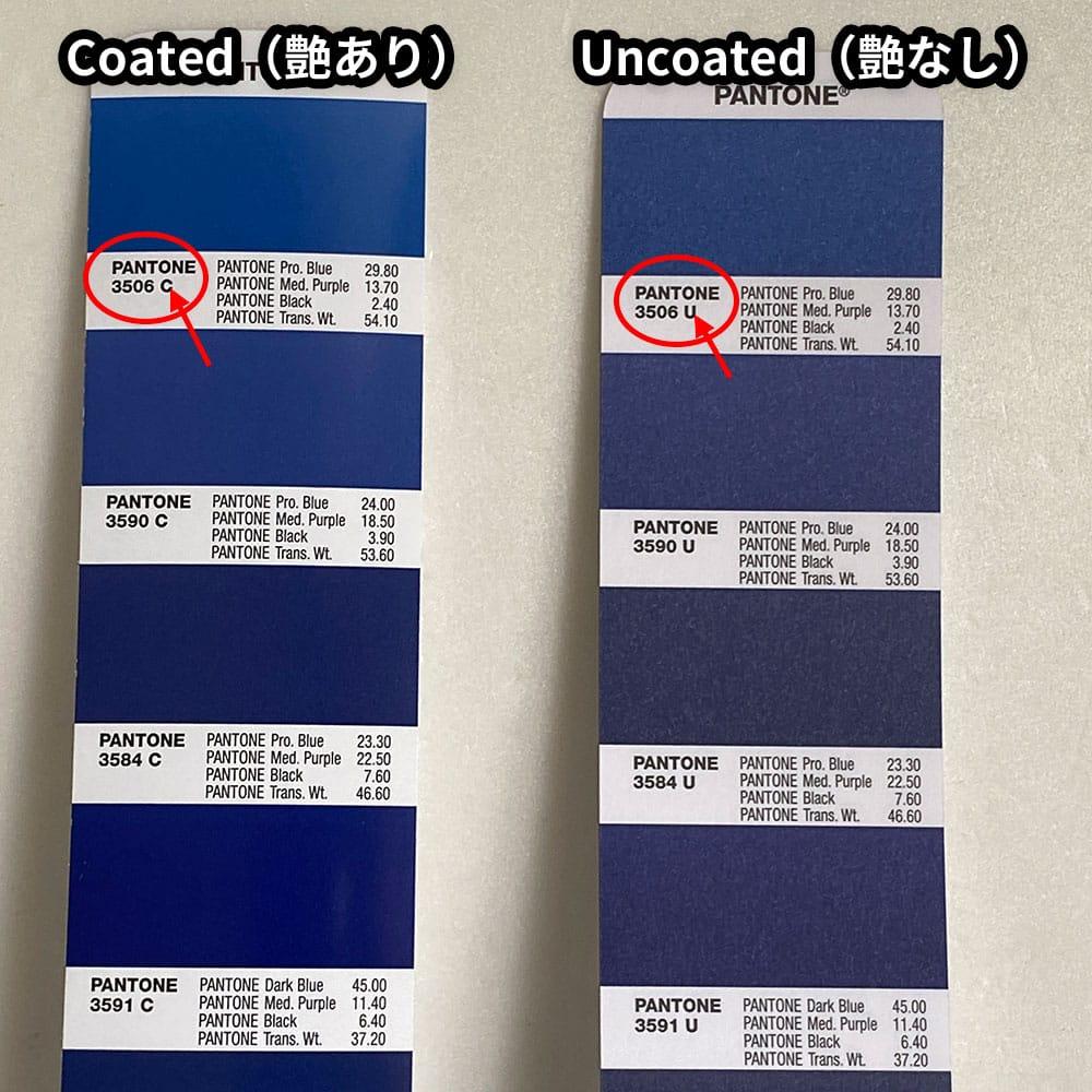

Image sources: pantone.com and other online resources (for educational purposes only).
- Coated colors = brighter, crisp colors
- Coated paper: ink stays on top > more light reflects > brighter color
- Uncoated colors = softer, muted colors
- Uncoated paper: ink absorbs > less light reflects > duller color
- Same numbers, different surface = different color.
- CMYK is not absolute — paper is part of the color
- Same CMYK values do NOT guarantee the same color
- Paper type is part of your color design
- Always choose CMYK Coated (C) or Uncoated (U) intentionally
- Match your color profile to the final print material
- Pantone = spot color system (ink-based standard)
CMYK = process color (printing simulation) - You are not “getting the same color”
- You are getting the closest printable CMYK version
Practical Tip
When you choose Pantone or CMYK values:
- Always specify Coated (C) or Uncoated (U)
- The same color will look different depending on the paper type
- Use Pantone C when printing on glossy or coated stock
- Use Pantone U when printing on matte or uncoated paper
- Never mix them randomly in one project unless intentional
When I select a Pantone CMYK color, such as Pantone P 2-8 C, it does not display standard CMYK values. Why?
- Pantone colors (even “Pantone CMYK guides”) are part of the Pantone Matching System
- They are library-based swatches, not simple CMYK percentages
- So when you pick Pantone P 2-8 C, you are selecting a named color standard, not raw CMYK numbers
- That’s why it doesn’t behave like typical CMYK sliders
CMYK (What you actually use in prepress)
- You define the values directly:
For example: C=0 M=0 Y=100 K=27 - It is a numeric color model
- Used in:
- Adobe Photoshop
- Adobe Illustrator
- Adobe InDesign
- Prepress workflows
Pantone CMYK Guide (e.g., Pantone P 2-8 C)
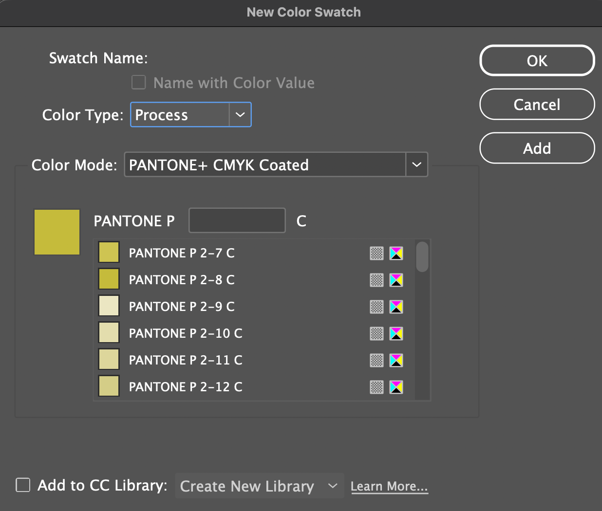
- This is a printed color swatch book
- Each color is still made from CMYK values: (C=0 M=0 Y=100 K=27)
- But it shows what that CMYK color actually looks like when printed
- This is a process color (CMYK simulation), not a true spot color like Pantone Solid (e.g., 397 C). “P” = Pantone PLUS CMYK, “C”=Coated paper
Which should you use in print production?
- Use CMYK values directly unless there is a specific need to consider spot color printing.
- In general, do not use Pantone P (CMYK) colors as your final production colors, because they are simulations rather than true spot colors.
Exceptions do exist:
> When the job is strictly CMYK process printing (no spot colors), Pantone CMYK equivalents can be used as a reference.
> When converting a design from spot color to process due to budget or printing limitations.
> When a close visual match is acceptable and exact brand color accuracy is not critical. - Pantone P colors are not special inks
> They are just predefined CMYK values
> Printing presses only use CMYK plates
> They read numbers like C=0 M=0 Y=100 K=27, not “P 2-8 C” - CMYK is for production, Pantone is for reference unless you are printing spot color.
For final production:
> Use true Pantone spot colors if precise color matching is required.
> Use properly defined CMYK values if the job is printed in process only.
Material sources: pantone.com and other online resources (for educational purposes only).
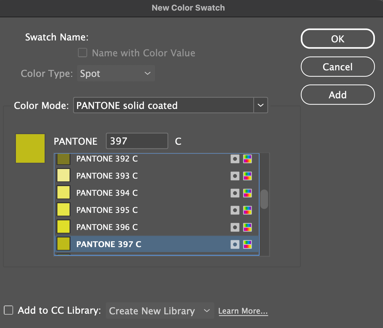
How to convert CMYK Process Colors to Pantone Spot Colors in Adobe Illustrator
- Create an object
- Set fill to C0 M0 Y100 K27
- Select the object
- Go to:
Edit > Edit Colors > Recolor Artwork - In the dialog:
- Switch “Color Library” to Color Books
- Choose Pantone Solid Coated
- Click “Advanced Options” on the Recolor panel
- Double click “New” to open Color Picker panel
Illustrator will automatically find the closest Pantone match: Pantone 397 C, and the spot color will be added into the Swatches” panel.
How to Convert CMYK Process Colors to Pantone Spot Colors in Adobe InDesign or Vice Versa
Adobe InDesign does not automatically convert CMYK colors to the nearest Pantone color the way Adobe Adobe Illustrator can. In Adobe InDesign, you typically need to manually identify and replace the process color with the closest Pantone spot color using the Pantone Color Bridge Guide.
You can also do this directly in InDesign by following these steps:
- Select the color swatch
- Choose New Color Swatch
- Change Color Mode to Pantone Solid Coated or Pantone Solid Uncoated
- Select the closest Pantone match manually from the list
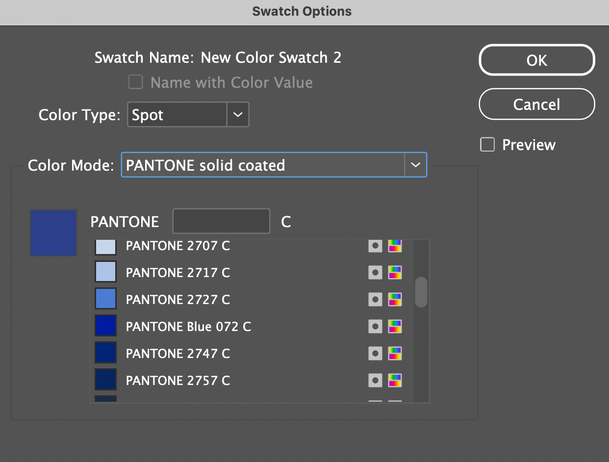
Convert CMYK Process Colors to Pantone Spot Colors in Adobe InDesign
Convert Pantone Spot Colors to CMYK Process Colors in Adobe InDesign
Easy Rule to Remember
Digital / Web > RGB = Process
Standard Print > CMYK = Process
Pantone Print: Spot = Spot
Pantone Color Bridge Guide
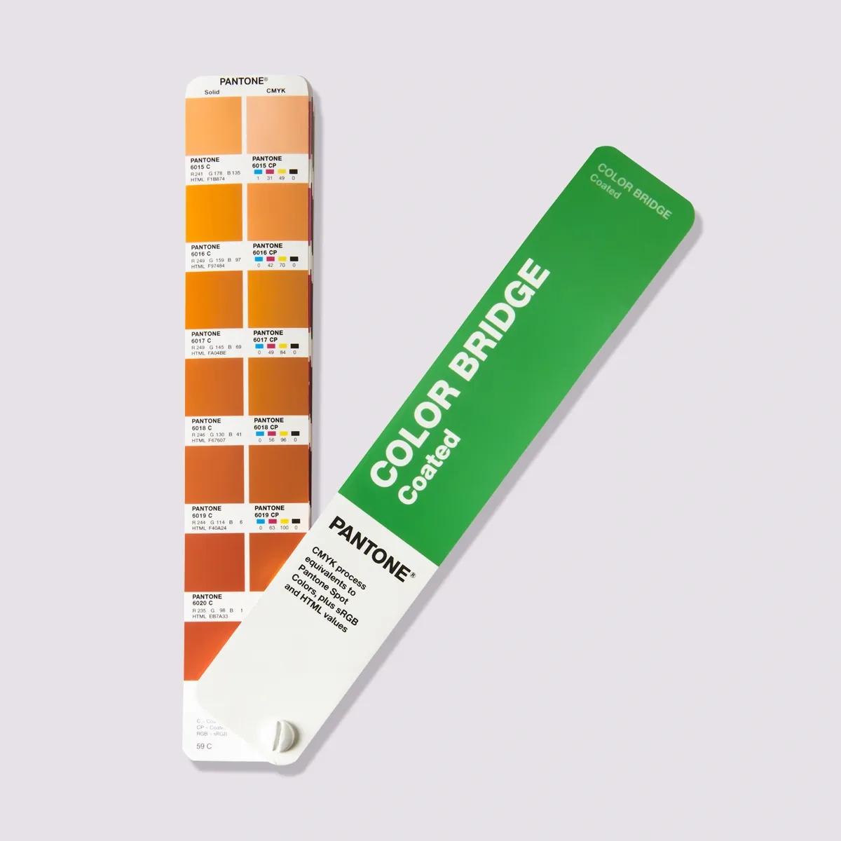
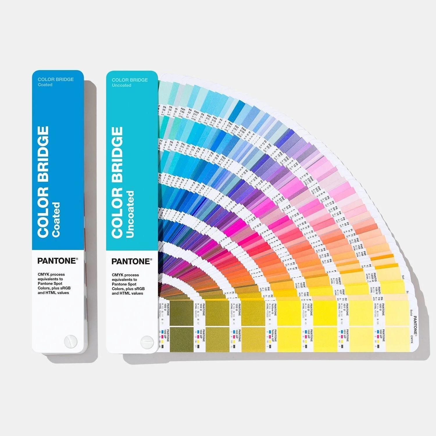
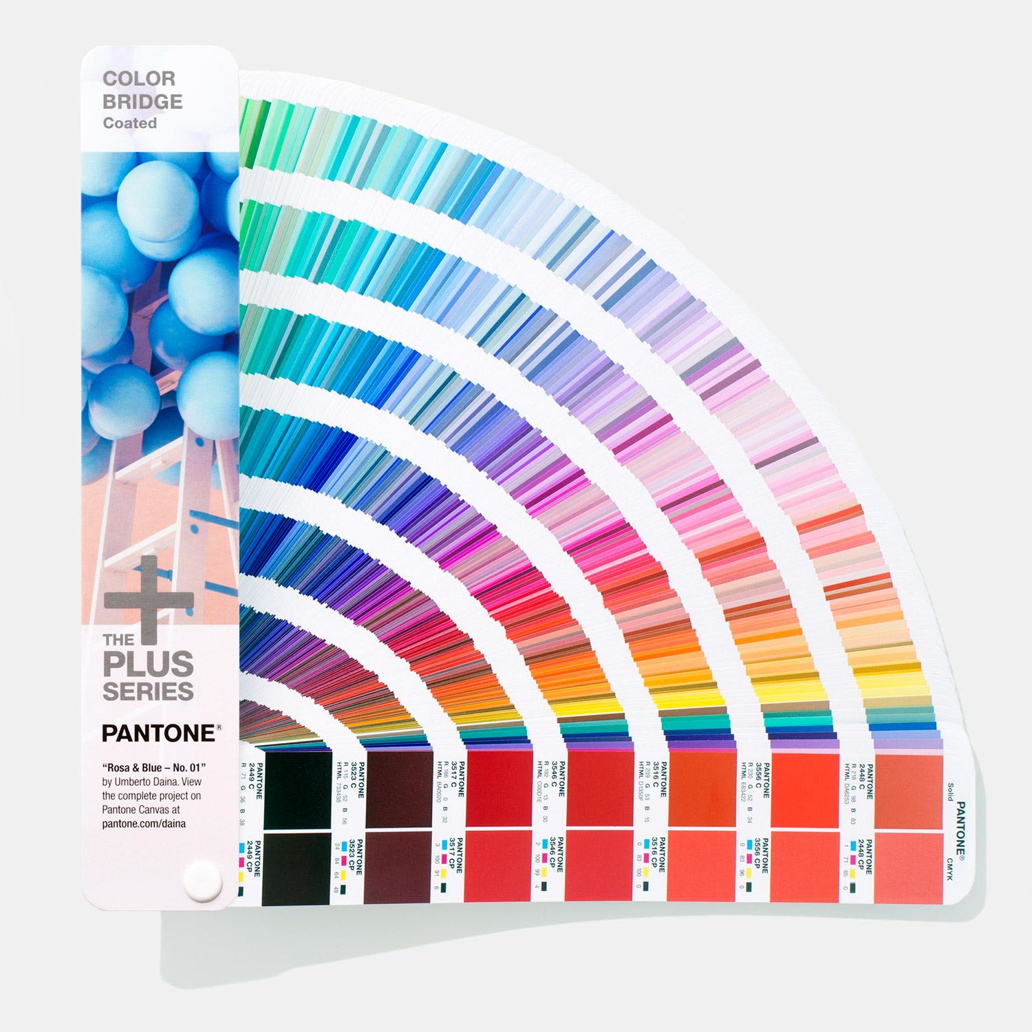
Image sources: pantone.com and other online resources (for educational purposes only).
- Pantone Color Bridge Guide Coated (Purchase Link)
- Pantone Color Bridge Guide Uncoated (Purchase Link)
Understanding Pantone Color Bridge
What is Color Bridge? It is not a new color system. Its purpose is to show:
On the left side: Pantone Spot Color
On the right side: Pantone Process Color
Pantone Color Bridge CMYK PC
PC = Process Coated
Used for U.S. and general commercial printing on coated paper.
Pantone Color Bridge CMYK UP
UP = Uncoated Paper
Used for uncoated paper, such as:
- Letterhead
- Kraft paper
- Stationery paper
- Standard paper bags
Because uncoated paper absorbs more ink, colors usually appear darker and duller. Used for U.S. and general commercial printing on uncoated paper.
How Do You Choose?
- Posters / Brochures / Magazines / Glossy Packaging
If the paper is glossy or smooth coated,
> Choose PC - Printing through a European print vendor
> Choose EC - Business cards / Stationery / Textured paper / Uncoated brochures or invitations
If the paper feels natural, matte, porous, or non glossy matte or uncoated paper,
> Choose UP
Uncoated paper absorbs more ink, so colors print darker, softer, and less vibrant than on glossy coated stock. The UP Pantone guide is designed to show how colors will appear on that type of paper.
Simulations of PANTONE MATCHING SYSTEM colors
Material sources: pantone.com and other online resources (for educational purposes only).
Pantone Formula Guide
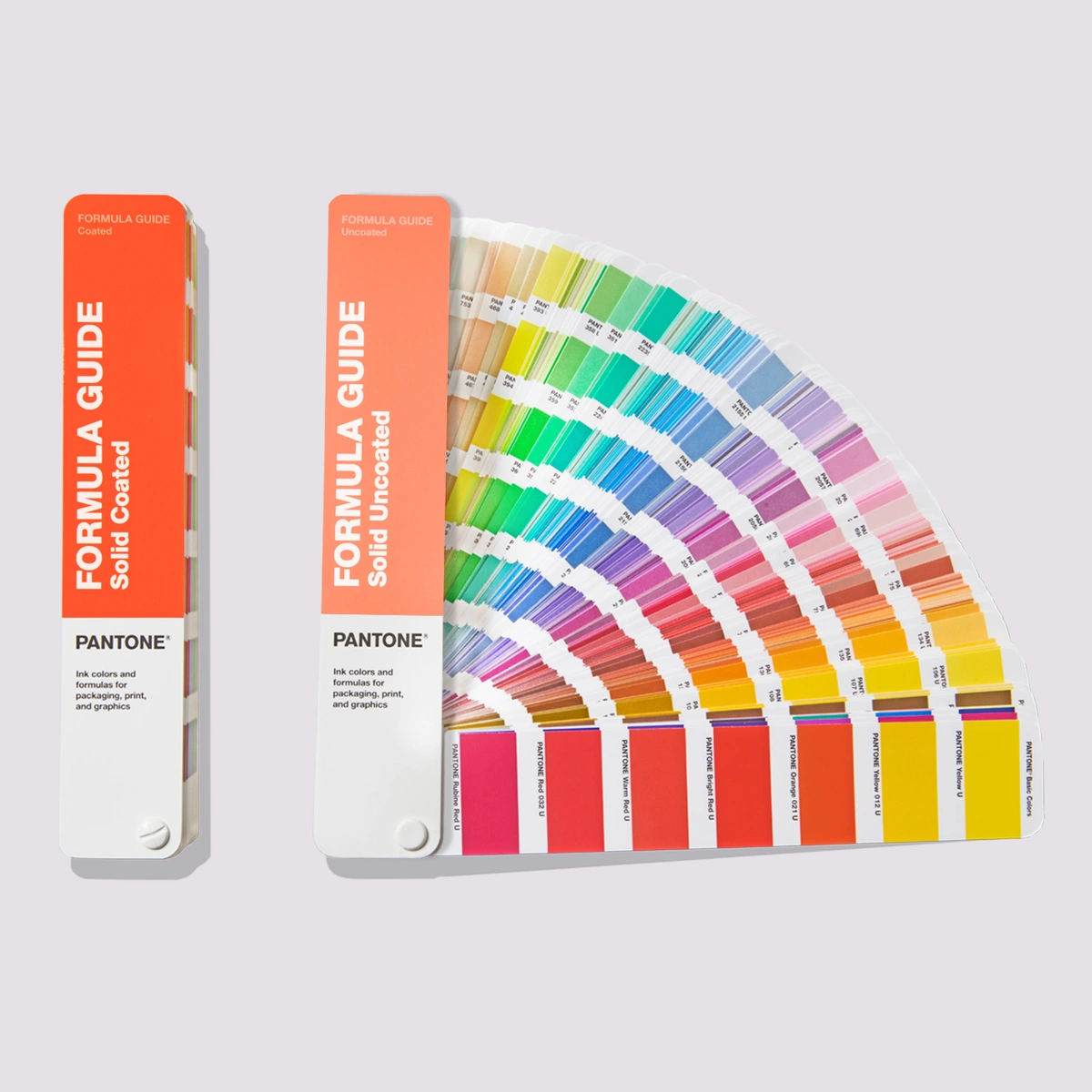
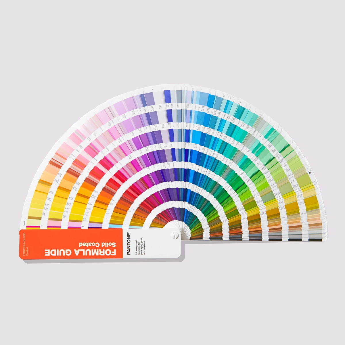
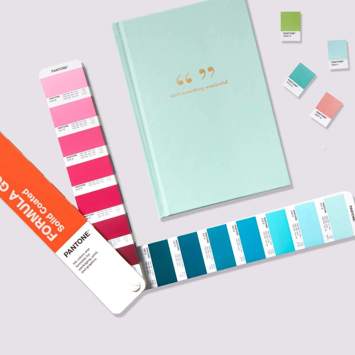
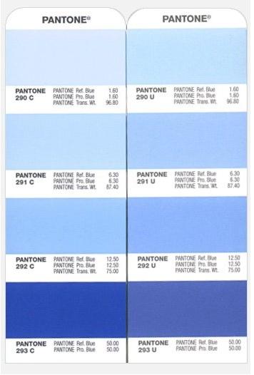
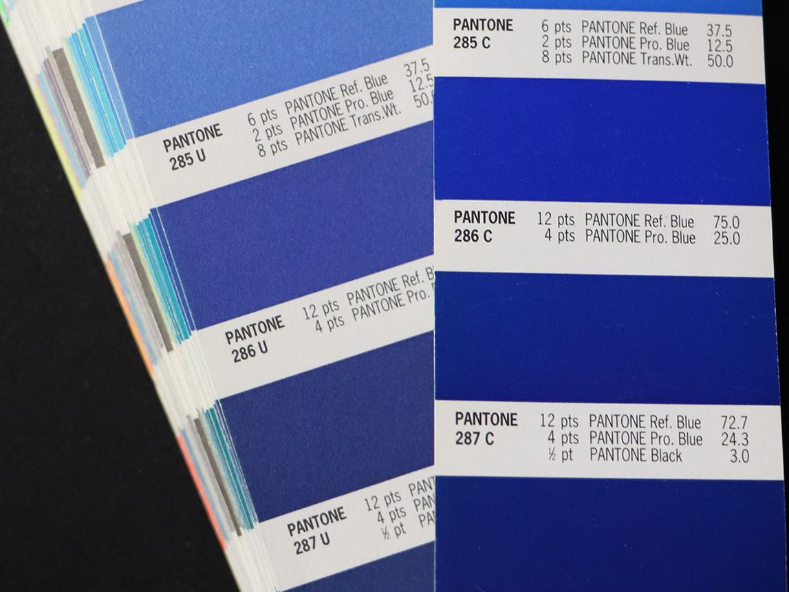
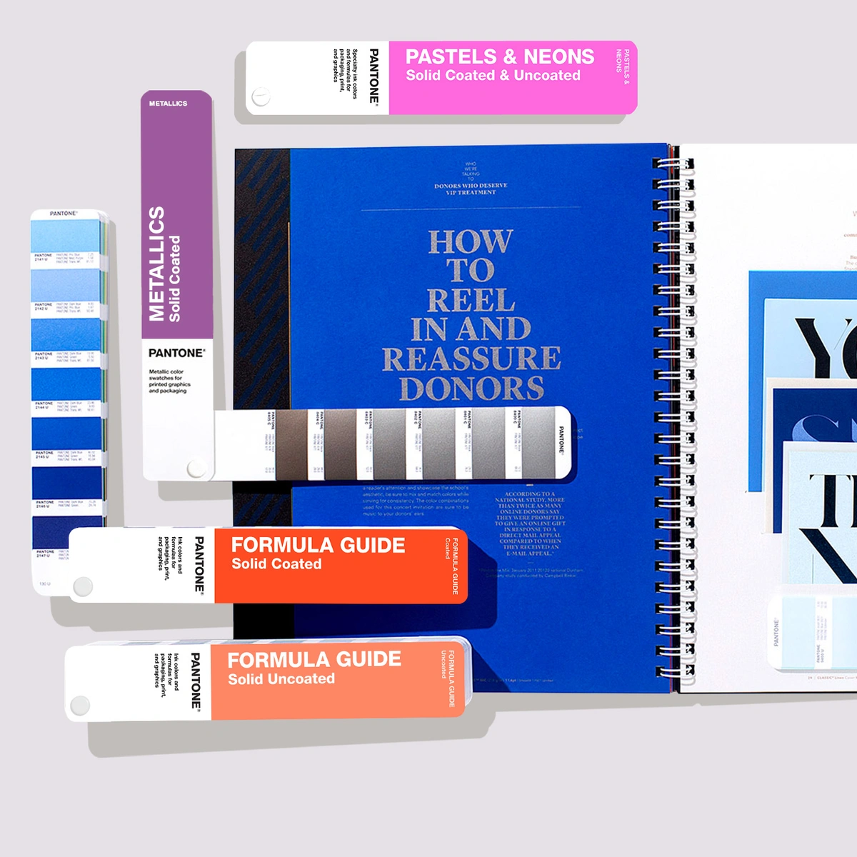
Image sources: pantone.com and other online resources (for educational purposes only).
How to convert Pantone to CMYK in Photoshop
- Open Color Picker
- Click Color Libraries
- Choose Pantone (e.g., Pantone+ CMYK Coated)
- Select your color (e.g., Pantone P 2-8 C)
- Click OK
- Go back to the Color Picker
You will now see the closest CMYK equivalent values
- These are approximations, not exact matches
- Pantone > CMYK conversion always involves some color shift
- Pantone CMYK (P series) is not a new color system. It is a printed reference of CMYK colors.
How to convert Pantone to CMYK in InDesign
- Open Swatches panel
- Double-click the Pantone swatch
- Change:
- Color Mode: from Spot > Process
- Click OK
InDesign will automatically convert it to CMYK values
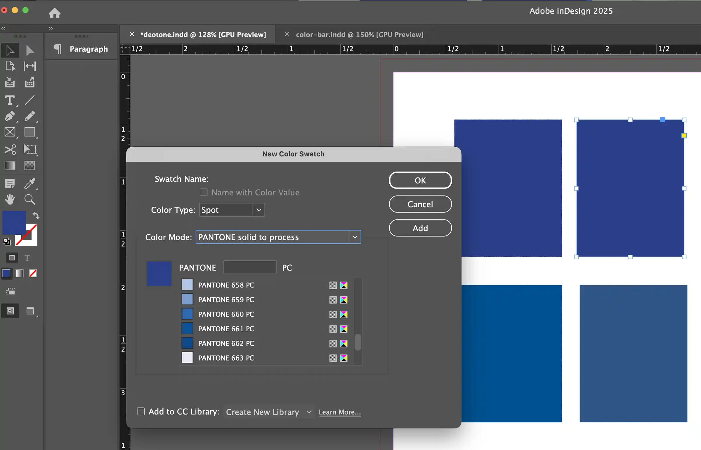
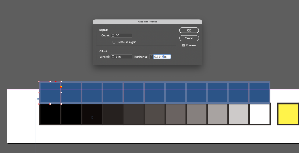
How to Create Color Bars for Layouts Using Spot Colors
- Create a document sized 5″ W × 0.5″ H in Adobe InDesign.
- Draw a square measuring 0.18″.
- Apply the spot color Pantone 653 U to both the fill and the stroke.
- Use Step and Repeat, entering the values shown in the reference screenshot.
- Adjust the swatches so that the second through the tenth decrease in tint by 10% increments.
- One blue spot color bar is now complete.
- Select all 11 squares. Hold the Option key to duplicate the color bar for the second spot color.
- Apply the spot color Pantone 121 U to both the fill and the stroke.
- Use Step and Repeat, entering the values shown in the reference screenshot.
- Adjust the swatches so that the second through the tenth decrease in tint by 10% increments.
- The yellow spot color bar is now complete.

Pantone Metallic Coated vs Pantone Metallic Uncoated
This refers to the same metallic ink concept printed on two different paper surfaces. The paper stock dramatically changes the final appearance. Metallic ink sits on top of the coated sheet, so more light reflects. The ink itself costs more than standard spot ink, and some printers may recommend foil stamping instead if you need extreme shine.
1. Pantone Metallic Coated (C)
Printed on coated paper (smooth, sealed, glossy or semi-gloss stock).
Result:
- Brighter metallic shine
- Stronger reflectivity
- Sharper details
- Richer, cleaner color appearance
- More premium / luxury look
Best for:
- Cosmetic packaging
- Premium labels
- Luxury brochures
- Retail boxes
- High-end business cards
2. Pantone Metallic Uncoated (U)
Printed on uncoated paper (porous, matte, natural texture stock). The ink absorbs more into the sheet, reducing sparkle.
Result:
- Softer metallic effect
- Less shine
- More muted appearance
- Slightly darker or flatter look
- Natural / craft / earthy premium feel
Best for:
- Stationery
- Eco packaging
- Invitations
- Textured papers
- Boutique branding
Quick Comparison
| Feature | Metallic Coated | Metallic Uncoated |
|---|---|---|
| Shine | High | Low to medium |
| Reflectivity | Strong | Softer |
| Detail sharpness | Higher | Slightly softer |
| Paper feel | Smooth | Natural / textured |
| Luxury style | Modern luxury | Organic luxury |
Important Design Reality
Even if the Pantone number is similar: 871 C ≠ 871 U visually
The coated version usually appears more brilliant than uncoated.
Pantone Gold Metallic Guide: 871 C vs 872 C vs 873 C
These are among the most commonly used Pantone metallic gold inks for printing.
1. Pantone 871 C
Classic Rich Gold
- Deep traditional gold
- Warm metallic bronze-gold tone
- Strong luxury feel
- Most famous metallic gold in Pantone system
Best for:
- Awards
- Luxury packaging
- University seals
- Prestige branding
- Certificates
Think: classic premium gold.
Advice for Pantone 871 C (Metallic)
Pantone 871 C is often considered the standard classic metallic gold for:
- premium packaging
- seals
- invitations
- university / institutional pieces
- Upscale branding
It is not foil and not CMYK gold.
It is:
- a spot ink
- mixed metallic ink with metal pigments
- printed as its own separate ink unit on press
If printed on uncoated paper
Then you would use:
Pantone 871 U
Same base color family, but appearance becomes softer and less shiny.
If you design a luxury business card:
- 871 C = best for glossy coated stock
- 871 U = best for matte cotton stock
When designers casually say Pantone Gold, many are often thinking of 871 C first.
2. Pantone 872 C
Lighter Yellow Gold
- Brighter than 871 C
- More yellow / radiant tone
- Cleaner modern gold look
- Slightly fresher appearance
Best for:
- Cosmetics
- Fashion packaging
- Jewelry branding
- Elegant modern logos
Think: champagne leaning gold.
3. Advice for Pantone 873 C (old-world gold)
Dark Antique Gold
- Darker, deeper metallic gold
- Brownish bronze undertone
- More vintage or heritage feel
- Sophisticated and serious
Best for
- Whiskey labels
- Leather goods
- Traditional brands
- Vintage packaging
Quick Comparison
| Pantone | Look | Style |
|---|---|---|
| 871 C | Rich classic gold | Prestige |
| 872 C | Bright yellow gold | Modern luxury |
| 873 C | Dark antique gold | Heritage luxury |
Important Printing Reality
Actual result depends on:
- Paper stock
- Coated vs uncoated sheet
- Ink density
- Press quality
- Lighting angle
So always request a drawdown / proof.
- 871 C is the safest gold for most premium branding assignments.
- If budget allows, Gold foil stamping often looks far better than metallic ink for logos.
- For branding or packaging projects:
> Want luxury and timeless: 871 C
> Want fashion / beauty / upscale modern: 872 C
> Want heritage / masculine / vintage: 873 C
Pantone TCX Colors
Pantone TCX is Pantone’s textile color system based on dyed cotton references, used to communicate fabric color consistently across design and production. It belongs to the Pantone Fashion, Home + Interiors system. Pantone says the cotton editions carry the suffix TCX, meaning textile, cotton edition, extended range.
T = Textile
C = Cotton
X = Extended range
The same number in different Pantone systems is NOT always visually identical, because materials affect color appearance.
Pantone Pantone TCX Color Standard Priority:
- Physical Cotton Swatch (true master standard)
- LAB Values (scientific numeric description)
- RGB (screen approximation)
- HEX (web approximation)
If a graphic designer/fashion designer needs to work across different media, what should they do?
The usual workflow is:
TCX > LAB > ICC color management > find the closest PMS / CMYK / RGB match. It is not done by directly flipping through a Formula Guide book.
The Pantone TCX system does not have Ink Formula Guides or Color Bridge Guides like Pantone Solid Colors. Because TCX is not a printing ink system. It is a textile color system, its tools and reference formats are completely different.
TCX communicates through cotton swatches, not through ink formulas. Many fashion brand designers use TCX colors when briefing graphic designers for packaging, and then the graphic designers convert them into PMS colors on their own. This step often creates disputes over color differences.
Why conversions from Pantone TCX to the closest PMS match are often inaccurate, and why the more vivid the color, the greater the risk.
Solution:
1. TCX is a fabric color. PMS is an ink color.
- TCX = color dyed on fabric
- PMS = color printed with ink on paper
Different materials create different visual results.
2. Bright colors cause the most problems
Colors like hot pink, bright orange, vivid blue, and neon-like shades:
- Fabric can appear very vibrant
- Print often cannot reproduce the same intensity
The more vivid the color, the higher the risk. Do not rely on number matching alone, and do not assume that TCX 17-xxxx equals PMS xxxx. That approach can be risky.
Instead, compare physical swatches by using the actual TCX swatch alongside a PMS guide to identify the closest visual match. This remains the most common and reliable method. For packaging, hangtags, labels, or boxes, always request and approve a printed proof before production begins. This is the safest way to ensure color accuracy.
Important for Designers
If you’re designing clothing or fabric products, use TCX swatches. If printing a brochure or packaging, use PMS instead.
Example Workflow
Fashion brand selects Pantone 19-4052 TCX Classic Blue > sends to factory > factory matches dye lot to Pantone cotton swatch.
For Your Print-based Design Project
Since you work is a print design rEduction, TCX matters when branding extends into:
- uniforms
- merchandise
- fabric banners
- retail interiors
- branded soft goods
Then you may need to coordinate PMS + TCX equivalents.