Peer Evaluation and Peer Critique on Flickr
https://www.flickr.com/groups/pxstudio_advanced-page-layout/pool/
https://www.flickr.com/groups/pxstudio_advanced-page-layout/discuss/72157721924632446/
ARTS-3333 Magazine Project – Peer Evaluation Results


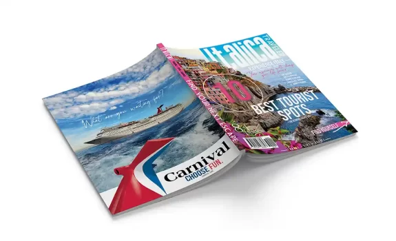
1st: Juan De La Garza’s magazine design / Section I (6 Votes / (293 Views)
https://heyzine.com/flip-book/6293ae007c.html
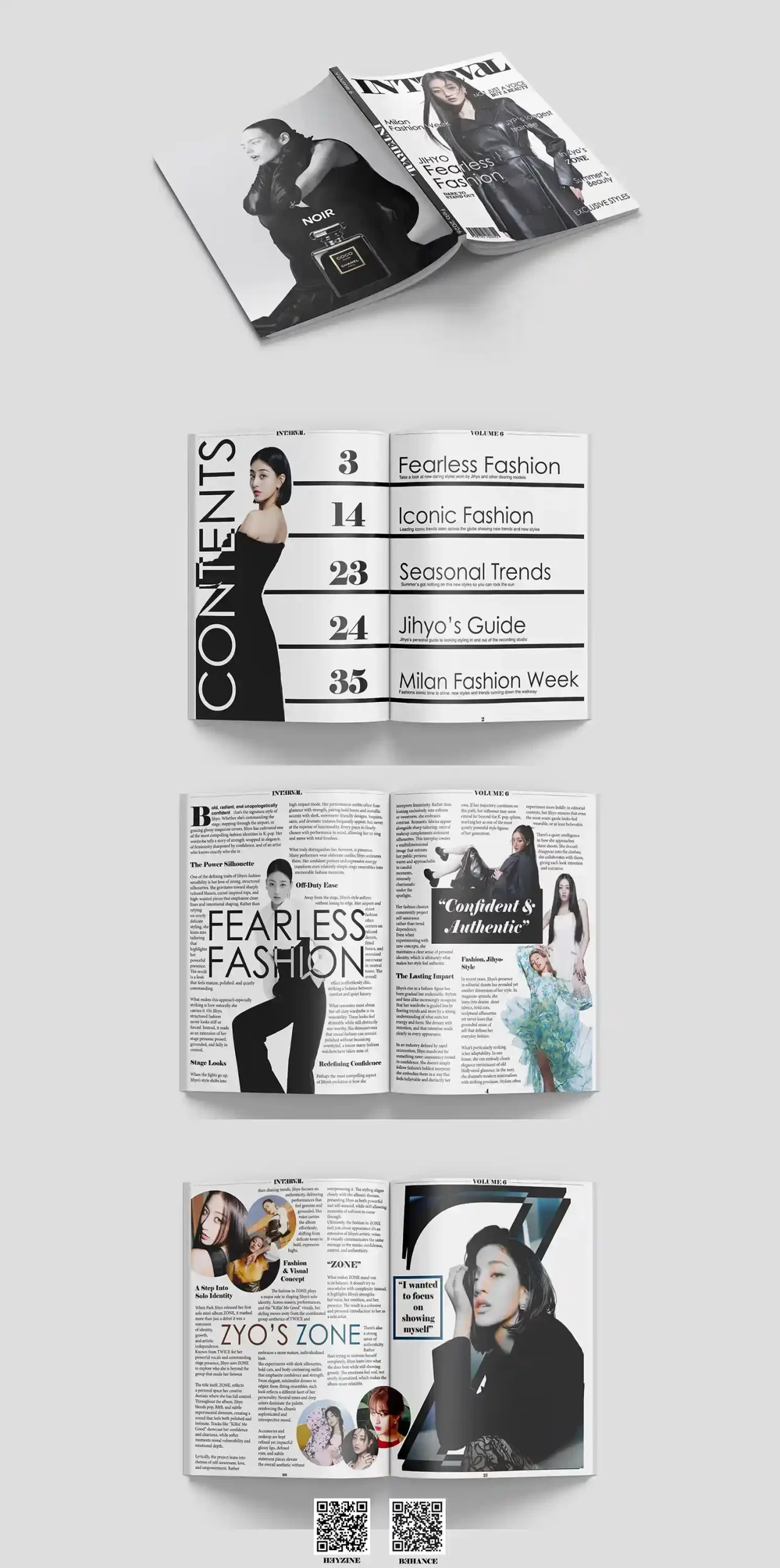
2nd: Maresa Villarreal’s magazine design / Section I (8 Votes / 286 Views)
https://heyzine.com/flip-book/3728dda592.html
3rd: Marcos Martinez’s magazine design / Section II (5 Votes / 264 Views)
https://heyzine.com/flip-book/70335a255f.html
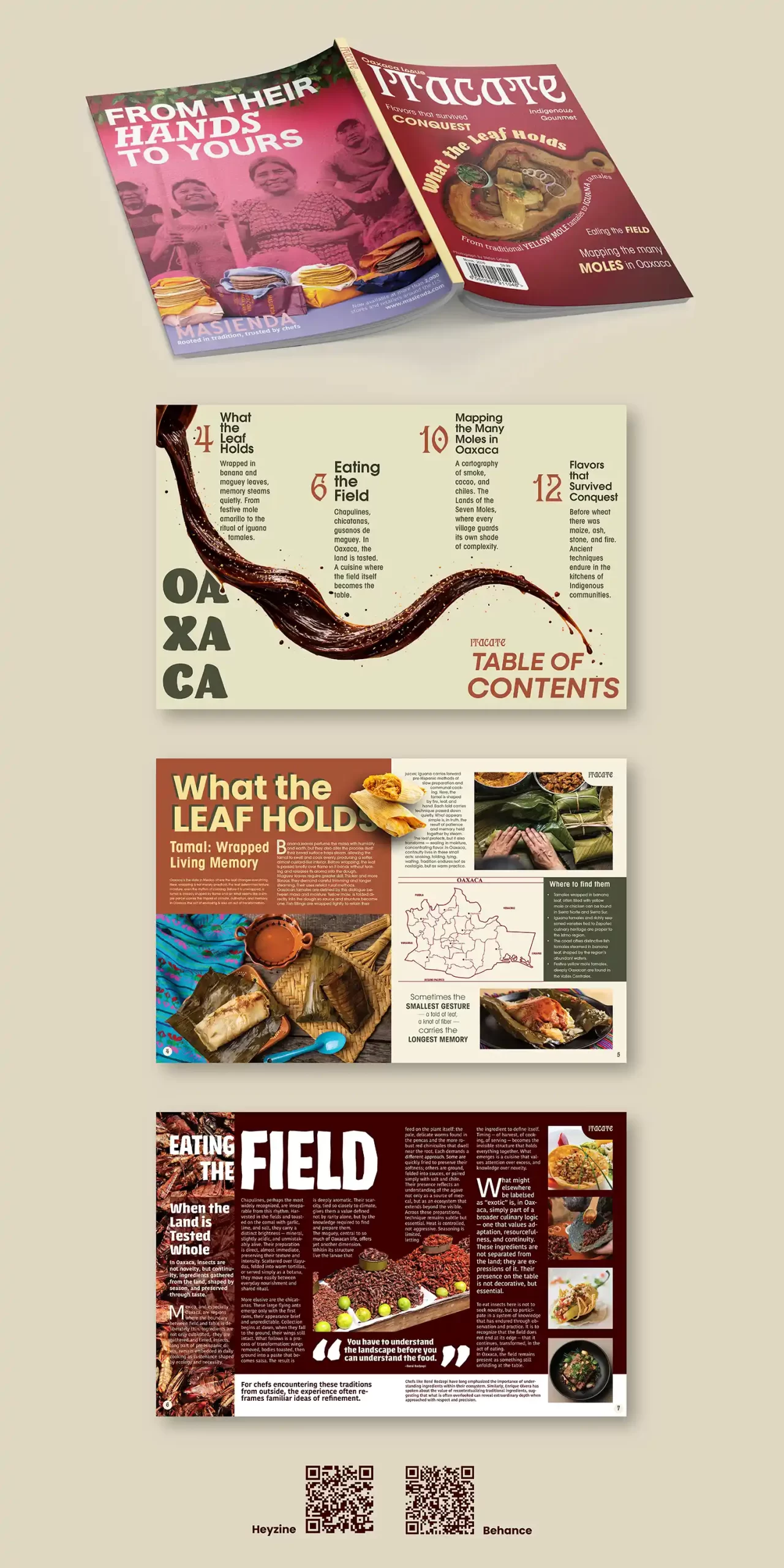
4th: Rosalisa Perez’s magazine design / Section I (6 Votes / 223 Views)
https://heyzine.com/flip-book/3b0446d179.html
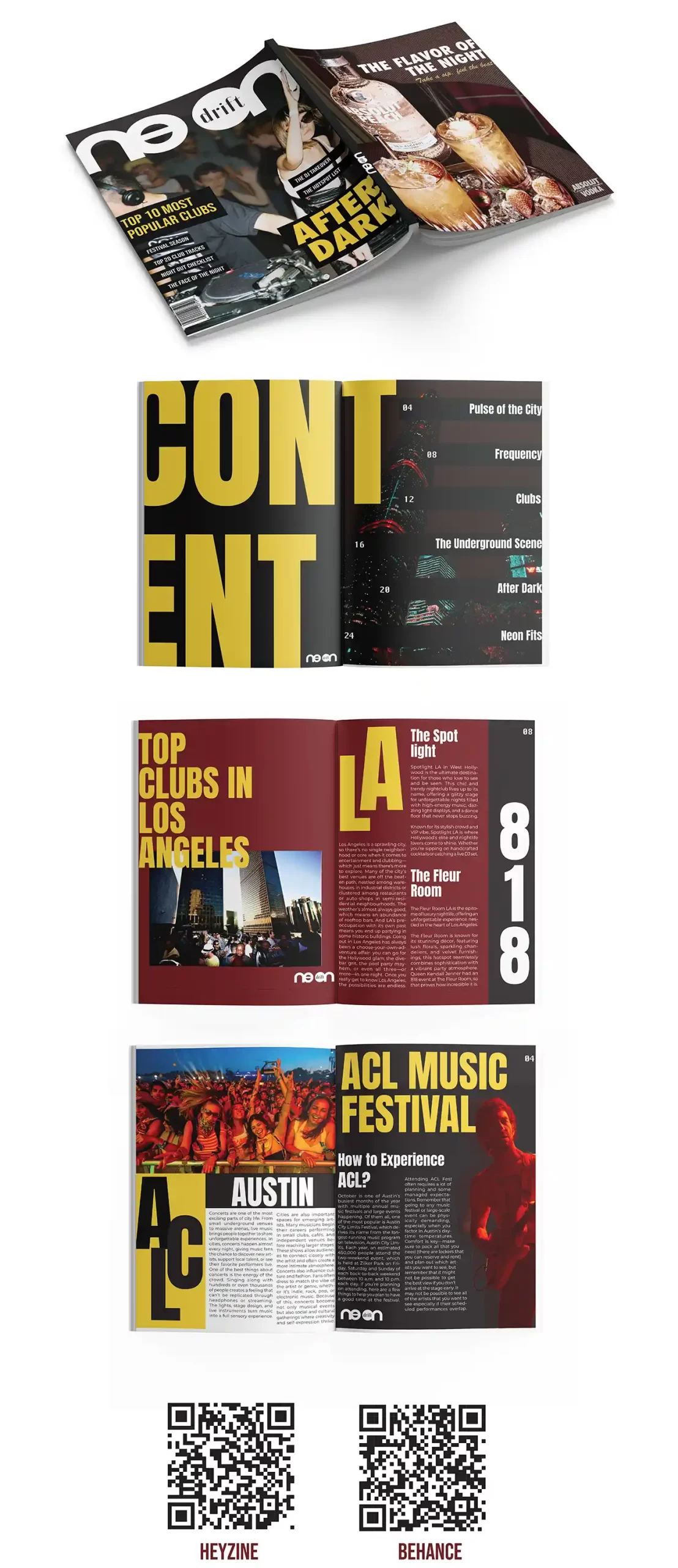
5th: Natalie Lawler’s magazine design / Section II (4 Votes / 237 Views)
https://heyzine.com/flip-book/643506cee6.html
Instructor Rankings and Comments
1st: Juan De La Garza’s magazine design / Section I (293 Views)
https://heyzine.com/flip-book/6293ae007c.html
The magazine design shows a strong visual hierarchy with clean typography and balanced layouts that are easy to follow. The images, spacing, and alignment create a professional look, while the consistent style makes the whole magazine feel connected. Overall, the magazine project demonstrates creativity, strong design skills, and a clear understanding of magazine layout through an impressive editorial design. Excellent job!
2nd: Abigail Rivera’s magazine project / Section I (296 Views)
https://heyzine.com/flip-book/ffb335f404.html
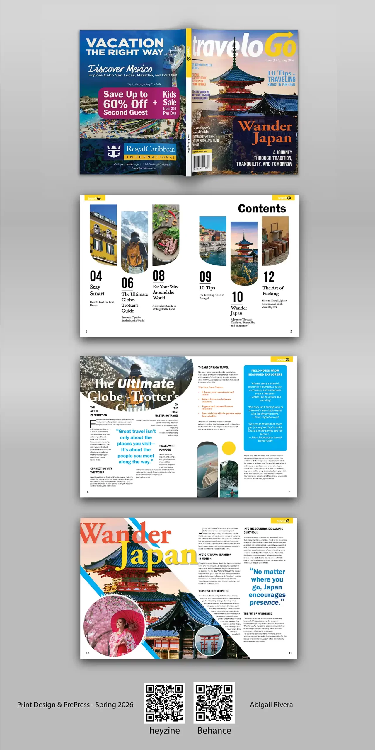
The magazine design presents a clean and modern layout with strong visual organization that makes the content easy to read. The use of photography, typography, and spacing creates an engaging travel theme while maintaining a professional editorial style. Overall, the project demonstrates creativity, solid layout skills, and a clear understanding of magazine design principles. Fantastic work!
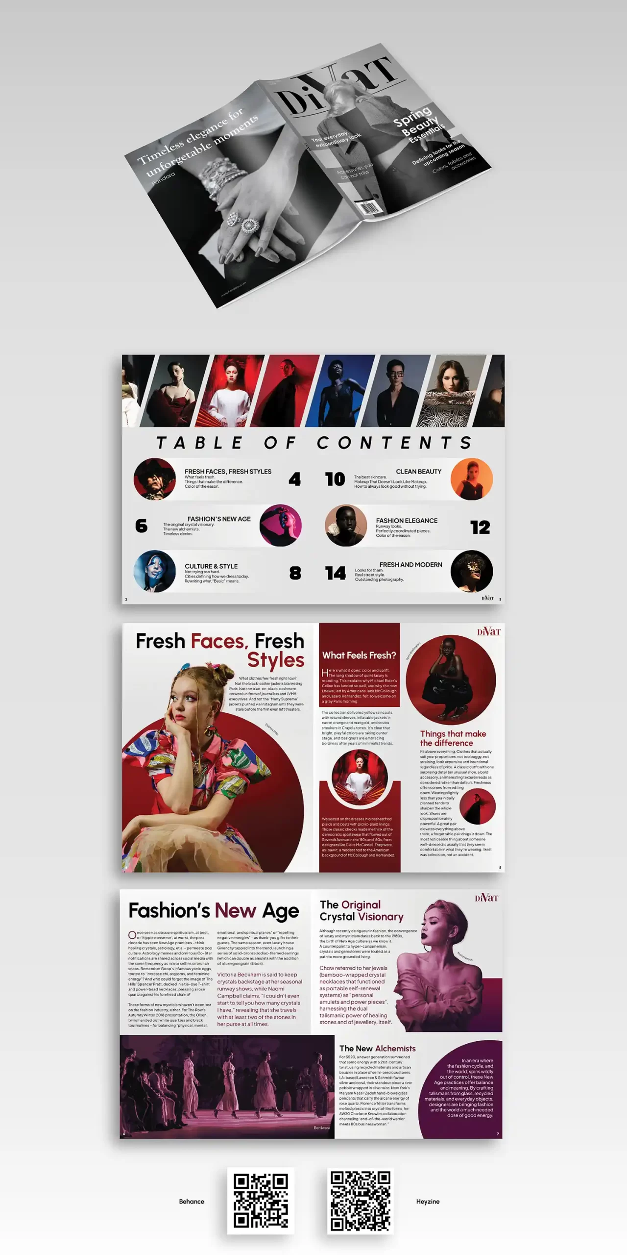
3rd: Natalie Lawler’s magazine design / Section II (237 Views)
https://heyzine.com/flip-book/643506cee6.html
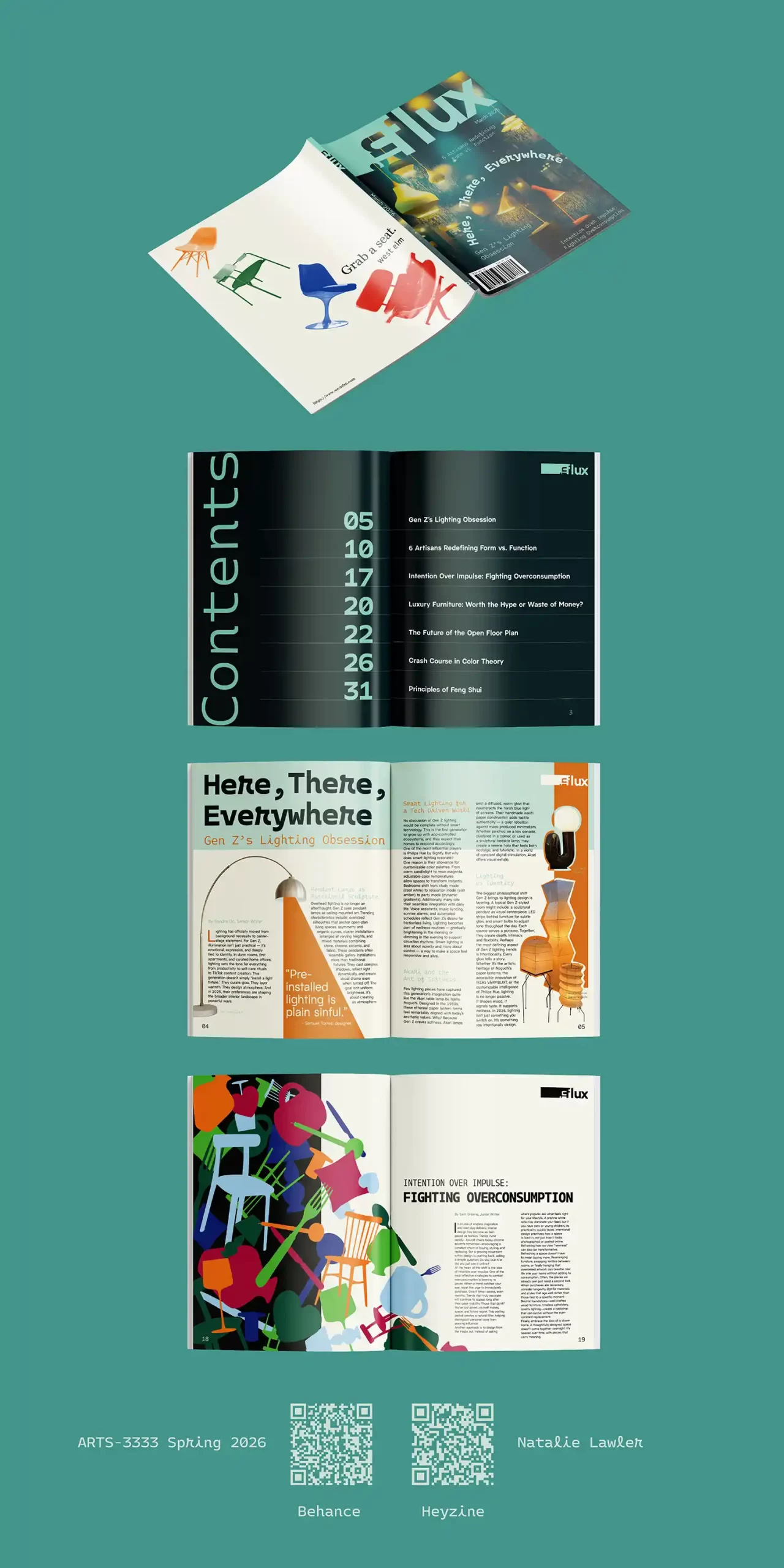
The magazine design presents a bold and modern layout, with strong positioning of images, text, and white space that creates an energetic editorial rhythm throughout the spreads. The masthead uses positive and negative space effectively, allowing the title to feel integrated with the cover image while maintaining clear visibility and visual interest. Overall, the project demonstrates strong creativity and layout skills, though some pages could be improved by refining hierarchy and spacing for an even smoother reading experience. Impactful!
4th: Teresa Casas’s magazine design / Section I (295 Views)
https://heyzine.com/flip-book/323b38a2f4.html
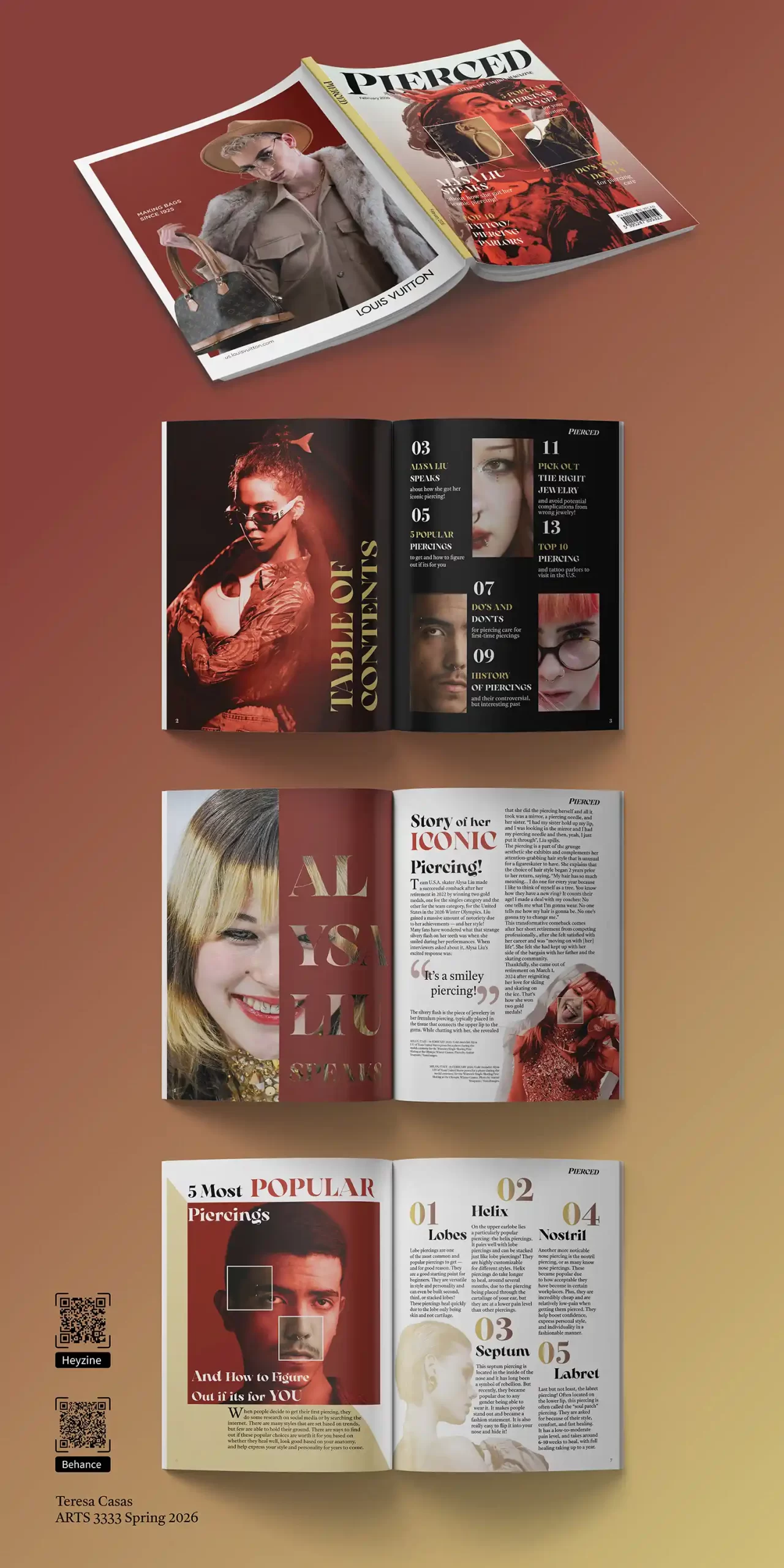
The magazine design presents a bold and expressive concept, with strong imagery, confident typography, and an edgy visual style that gives the publication a clear identity. The large print approach creates strong impact, though some spreads could be improved by refining spacing, alignment, and hierarchy to maintain readability while preserving the dramatic aesthetic. Overall, the project demonstrates creativity, fearless design choices, and a provocative editorial presence.
5th: Nilda Gomez’s magazine design / Section II (283 Views)
The design presents the magazine in a realistic and professional way, helping showcase the layout and branding effectively. The clean composition, lighting, and presentation angles make the project visually appealing while highlighting the design details clearly. Overall, the bold magazine layout system enhances the design concept and demonstrates strong attention through a dynamic, impressive, and contemporary visual showcase. Striking!
6th: Marcos Martinez’s magazine design / Section II (264 Views)
https://heyzine.com/flip-book/70335a255f.html
The magazine design shows a strong sense of composition, with thoughtful positioning of text, images, and white space that creates a clean and organized reading experience. The overall layout feels modern and visually engaging, though some spreads could be improved by strengthening hierarchy and adding more variation in scale to create stronger focal points. Overall, the project demonstrates solid editorial design skills, with good structure and clear potential for even greater visual impact.
7th: Regina Benet’s magazine project / Section I (279 Views)
https://heyzine.com/flip-book/07197e5d4b.html
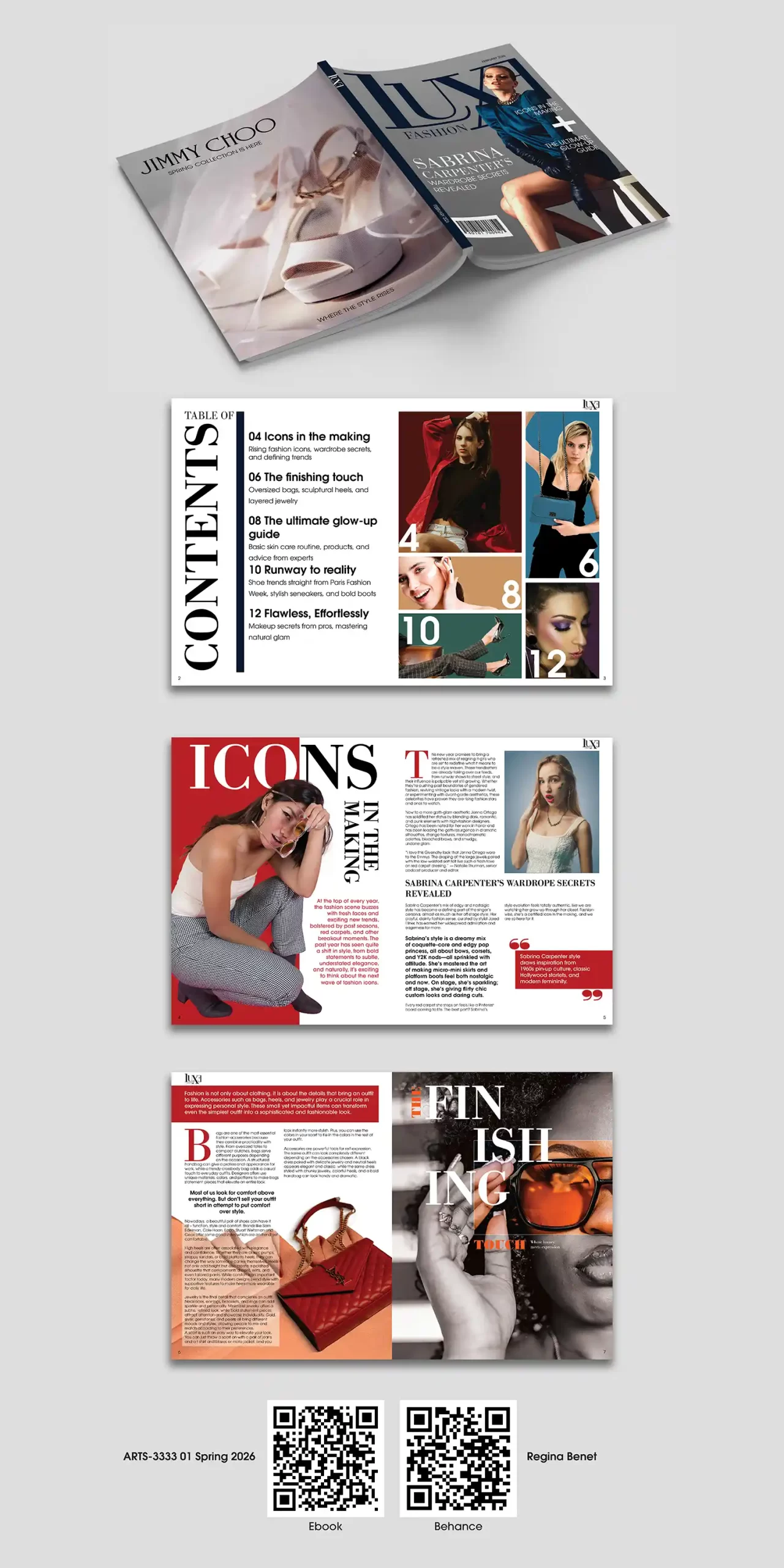
The sophisticated magazine design has a clean and modern style, with effective use of spacing and image placement that creates an organized layout. However, some spreads could benefit from stronger typography contrast, clearer visual hierarchy, and more dynamic alignment to better guide the reader through the content. Overall, the project shows solid design ability and creativity, with good potential to become even stronger through refinement of visual flow and focal emphasis.
8th: Christian Macias’s magazine design / Section I (270 Views)
https://heyzine.com/flip-book/78b4958b05.html
The elegant magazine design shows a clean and stylish layout, with thoughtful positioning of images, typography, and white space that creates a balanced reading experience. The overall concept feels fashionable and visually appealing, though some pages could be improved by adding stronger hierarchy and more contrast to better direct the viewer’s attention. In addition, the cover image lacks eye contact, which is often important for capturing readers’ attention and creating a stronger connection with the audience.