Project Brief-3: Large-Format Print Design & Prepress
(+Creating Toned Images for BRM Design)
https://pxstudio.us/blog/?p=80195
Peer Evaluation and Peer Critique on Flickr
https://www.flickr.com/groups/pxstudio_advanced-page-layout/pool/
https://www.flickr.com/groups/pxstudio_advanced-page-layout/discuss/72157721924956160/
ARTS-3333 BRM Project – Student Peer Evaluation Results
These projects were created and presented for educational purposes only as student work and are not intended for commercial use. Some images or visual assets may have been sourced from free online resources. If there are any copyright concerns or violations, please contact us and the content will be reviewed and removed if necessary.
1st-1: Monse Calleja‘s BRM Design – Section II (6 First-Place Student Votes)
https://www.behance.net/gallery/249021753/BRM
1st-2: Regina Benet‘s BRM Design – Section I (6 First-Place Student Votes)
www.behance.net/gallery/248967817/Luxe-Magazine
1st-3: Perla Alfonso‘s BRM Design – Section I (6 First-Place Student Votes)
https://www.behance.net/gallery/249187289/ARTS-3333-Spring-2026-BRM-Project/modules/1443117685
2nd-1: Juan De La Garza‘s BRM Design – Section I (4 Second-Place Student Votes)
https://www.behance.net/gallery/249152337/BRM-Project
2nd-2: Abigail Rivera’s BRM Design – Section I (4 Second-Place Student Votes)
https://www.behance.net/gallery/248733671/BRM-Travelogo-Magazine-BRM-Design
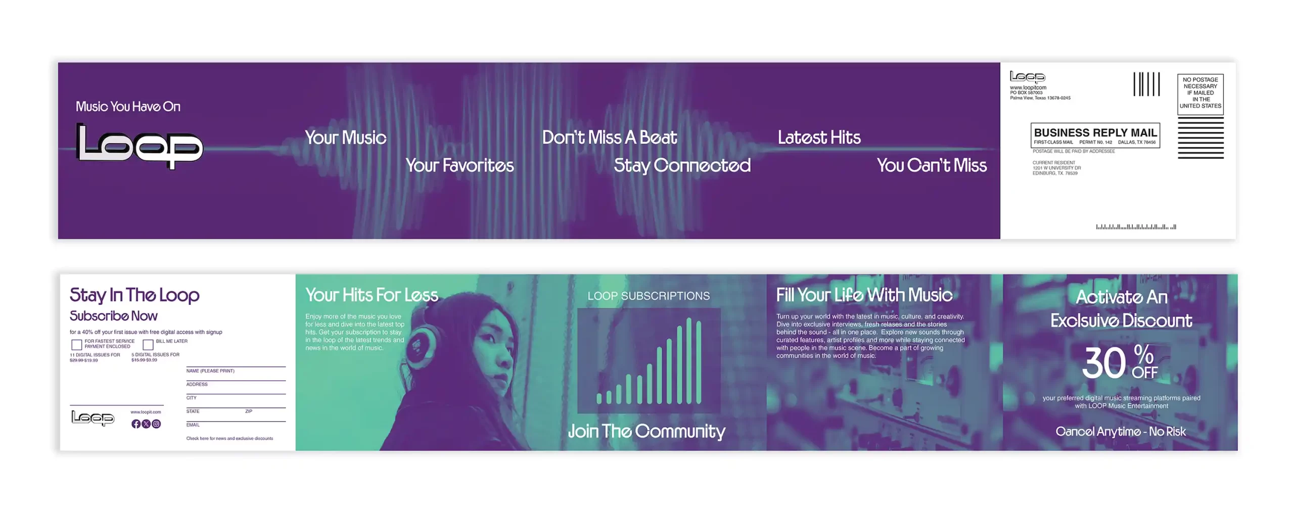
2nd-3: Natalie Lawler‘s BRM Design – Section II (4 Second-Place Student Votes)
https://www.behance.net/gallery/249076337/Influx-Magazine-Business-Reply-Mailer
3rd: Christian Macias Barba‘s BRM Design – Section I (3 Third-Place Student Votes)
https://www.behance.net/gallery/249167081/Business-Reply-Mail-Design-(BRM)
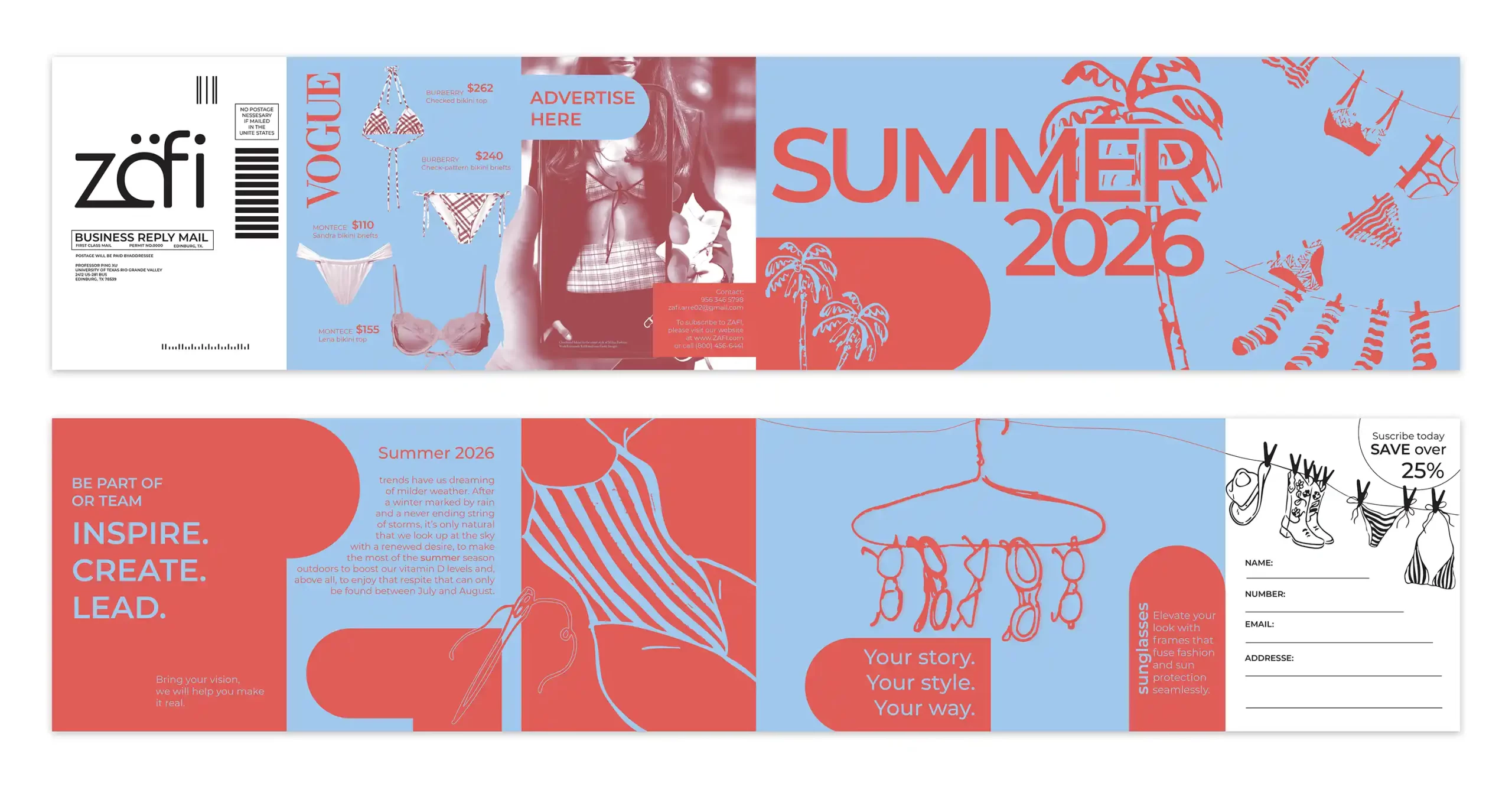
4th-1: Ana Arredondo‘s BRM Design – Section II (3 Fourth-Place Student Votes)
https://www.behance.net/gallery/249185015/BRM-design-

4th-2: Ariana Rubio‘s BRM Design – Section II (3 Fourth-Place Student Votes)
https://www.behance.net/gallery/248901051/Arianna-Rubio-P3
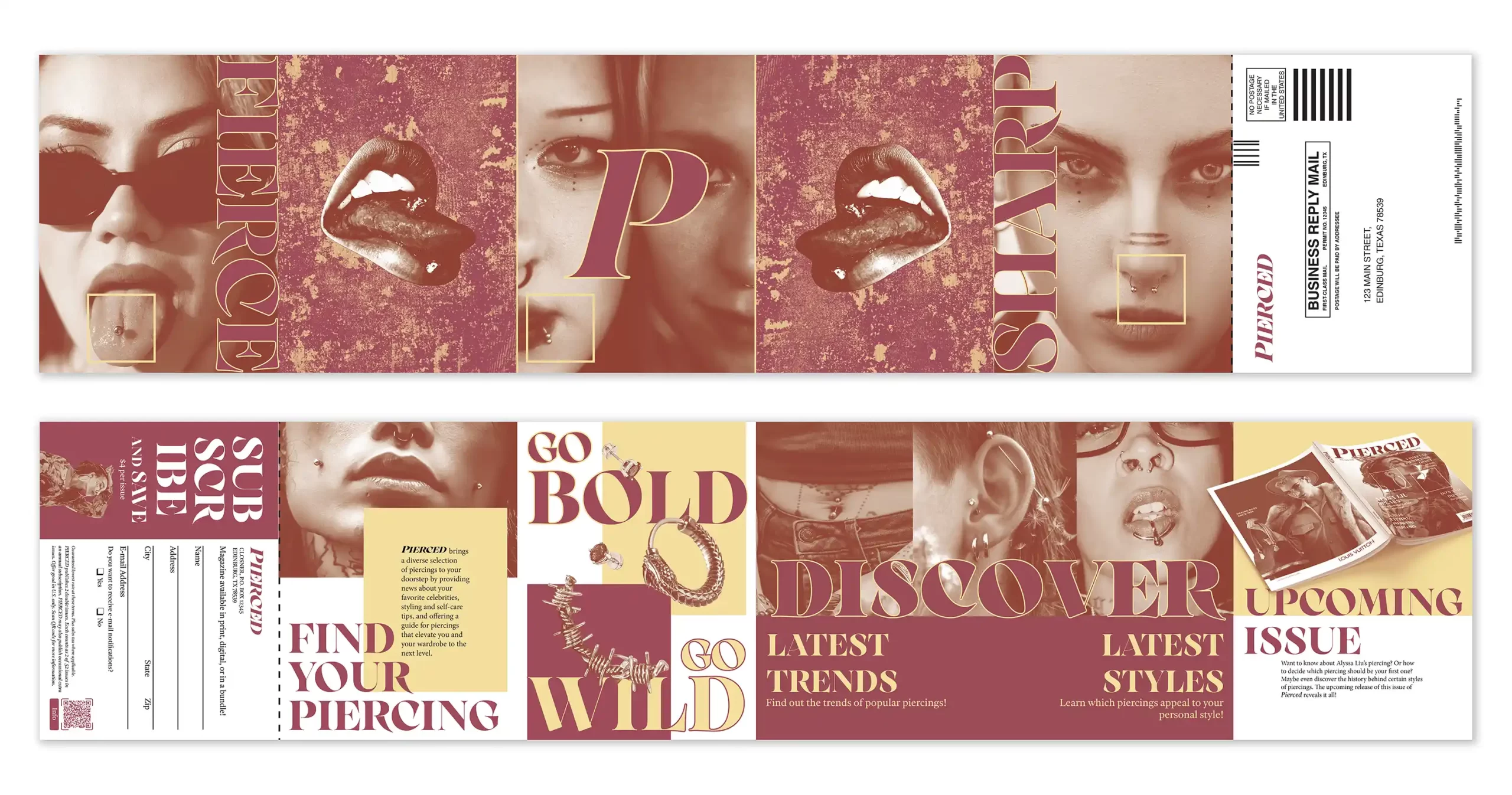
4th-3: Teresa Casas‘s BRM Design – Section I (3 Fourth-Place Student Votes)
https://www.behance.net/gallery/248897611/Pierced-Business-Reply-Mail
5th: Jaelyn Navarez‘s BRM design – Section I (6 Fifth-Place Student Votes)
https://www.behance.net/gallery/249185475/Business-Reply-Mail-Des..
6th: Nilda Gomez‘s BRM design – Section II (2 Sixth-Place Student Votes)
https://www.behance.net/gallery/248902867/BRM-Project
Instructor’s Top Ten Rankings and Comments
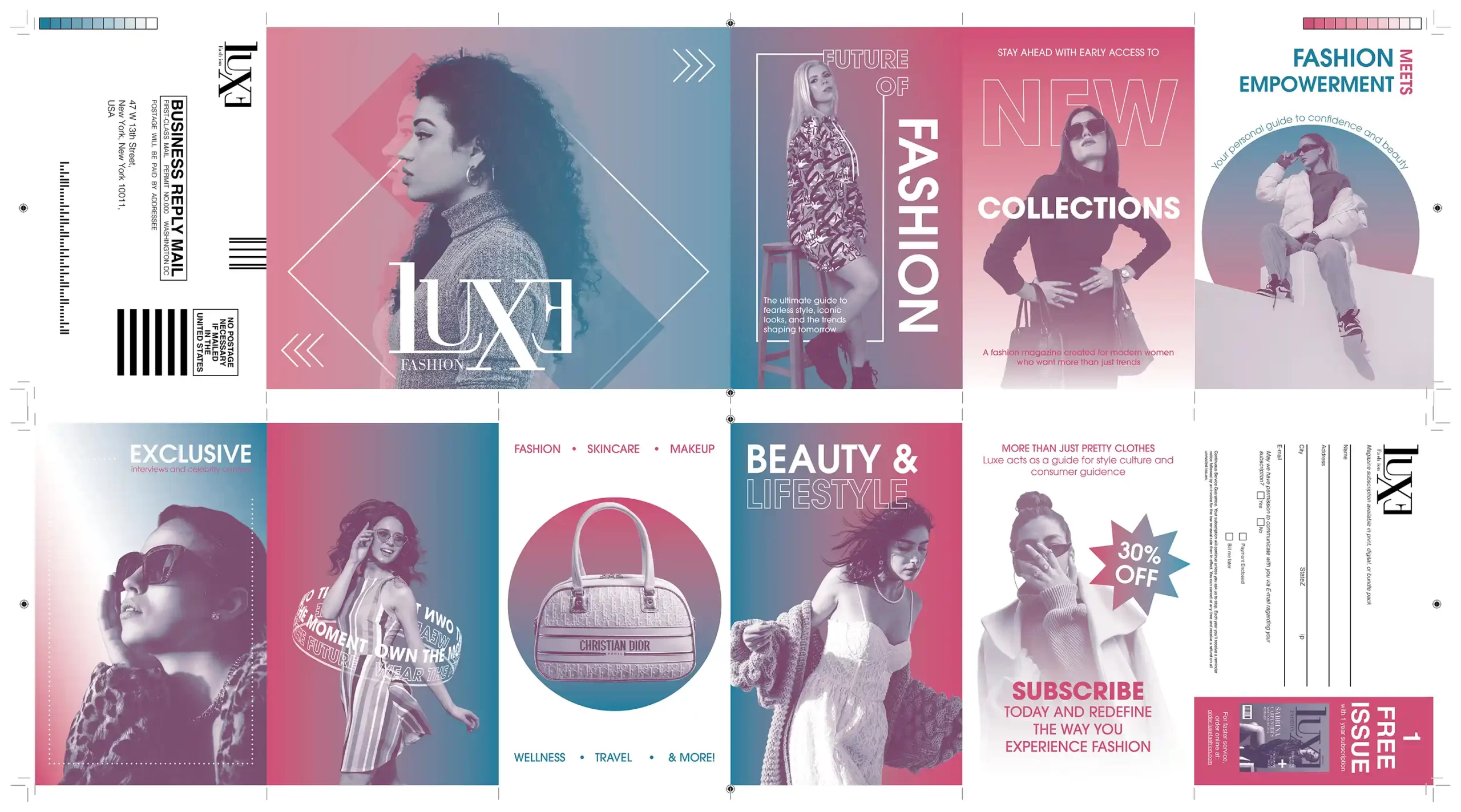
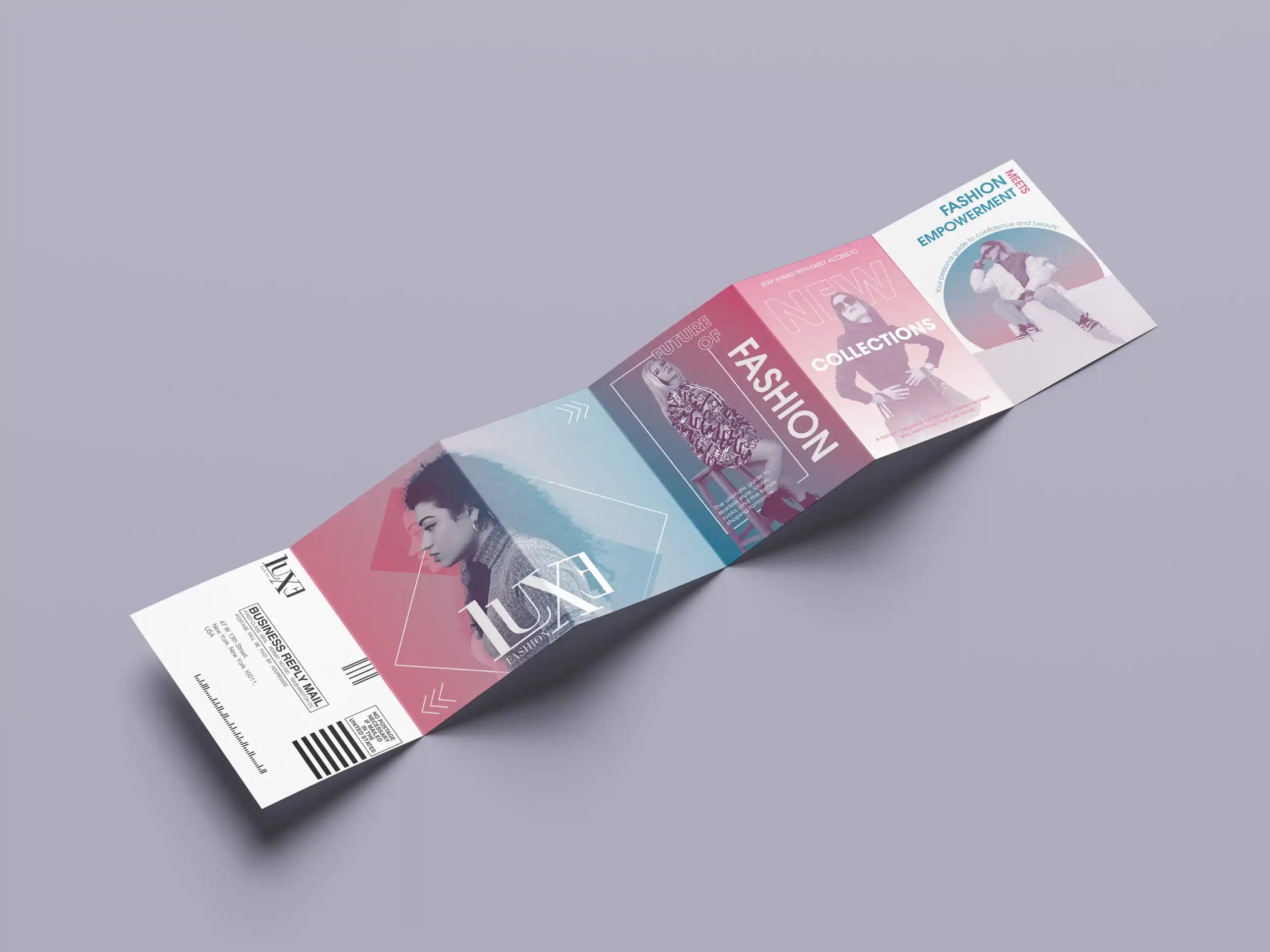
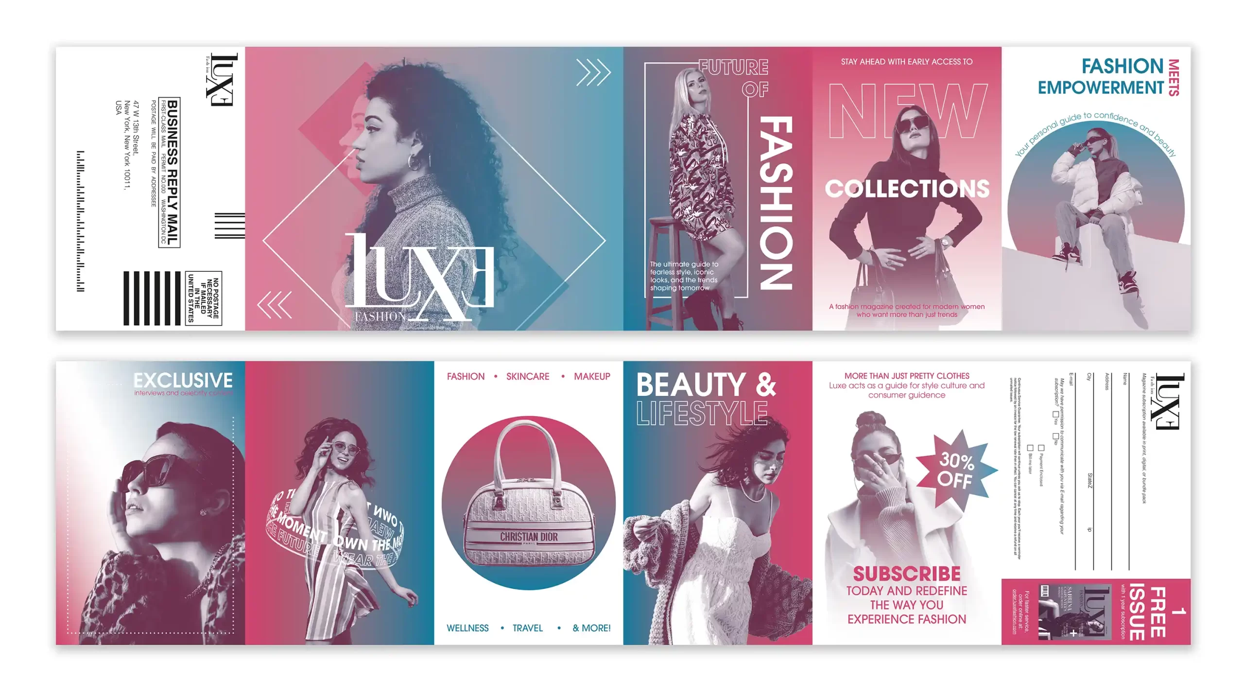
1ST: LUXE Fashion BRM – Section I (13 Student Votes)
www.behance.net/gallery/248967817/Luxe-Magazine
- 6 1st-Place Student Votes
- 4 2nd-Place Student Votes
- 2 3rd-Place Student Votes
- 1 4th-Place Student Votes
- Instructor’s Choice for First Place
It is an absolutely beautiful design. The project cleverly uses two spot colors to visualize the entire layout system in a highly refined way. The overall aesthetic feels bold, modern, and full of visual energy, with strong contrast and focal points that immediately capture attention. The dynamic composition, gradient effects, and geometric framing create a contemporary and stylish fashion identity with strong poster-like impact from a distance. The design also demonstrates clear visual hierarchy, emotional energy, and a confident fashion-brand presence throughout. The mockup presentation is also very successful, as the folded format enhances the realism and helps showcase the flow and continuity of the overall layout in a highly professional way. Very well done, Regina. I would strongly suggest submitting this work to the UDA Idea Design International Competition in September and the ADDY Awards in December 2026, as it has strong potential to become an award-winning entry in both competitions.
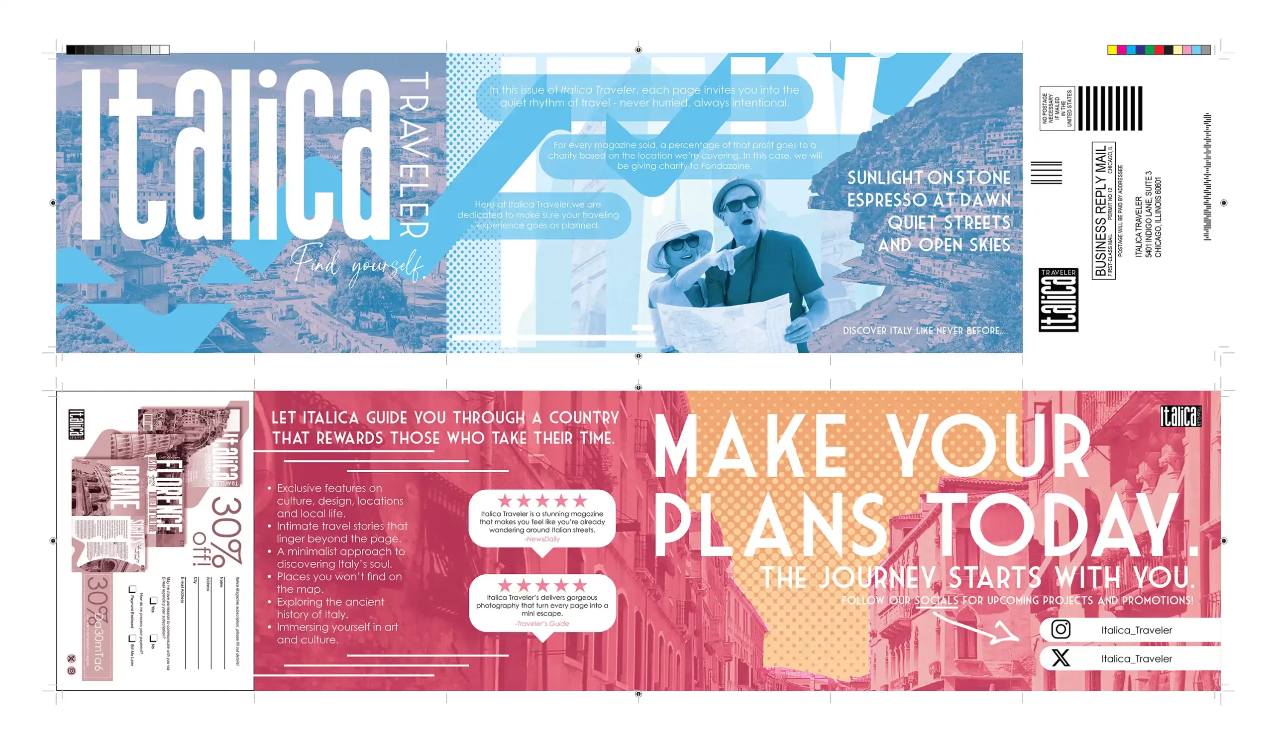
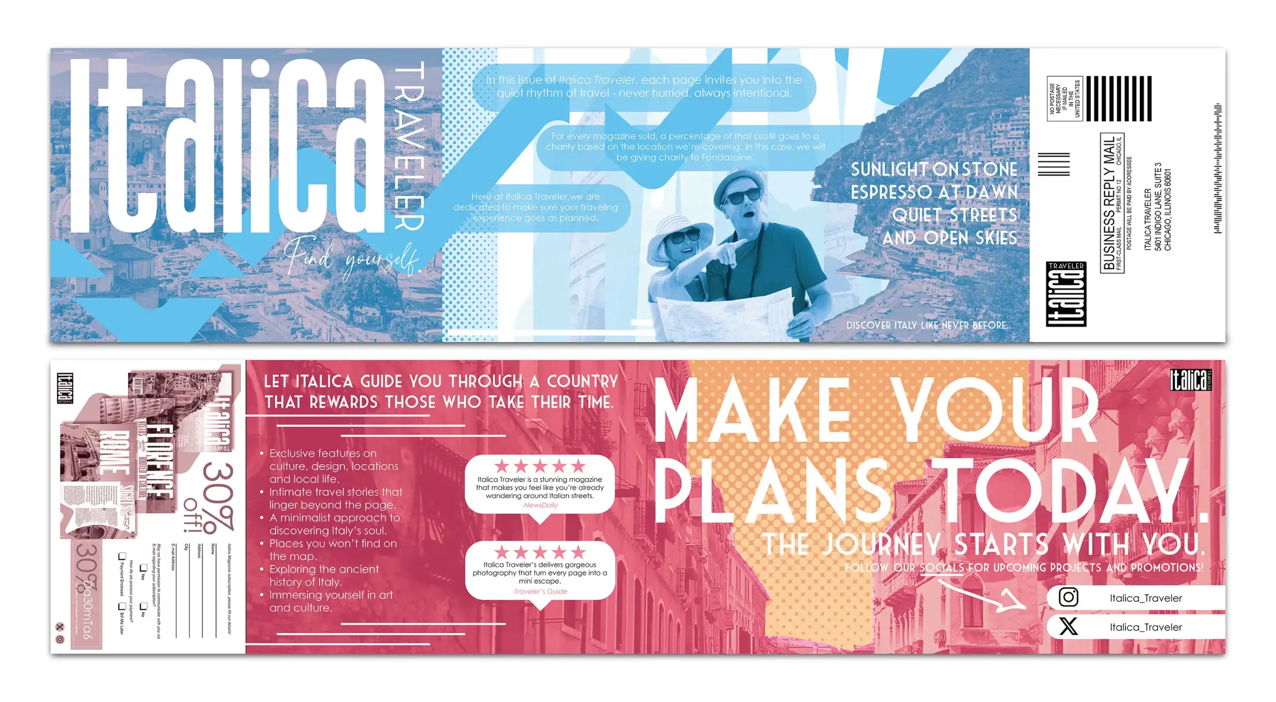
2ND: Italica Traveler BRM – Section I (12 Student Votes)
https://www.behance.net/gallery/249152337/BRM-Project
- 3 1st-Place Student Votes
- 4 2nd-Place Student Votes
- 5 3rd-Place Student Votes
- Instructor’s Choice for Second Place
This is a very strong and beautifully executed design. The project skillfully combines halftone gradients, color fading techniques, and modern design language to create a sophisticated editorial and travel-magazine atmosphere with a clear visual identity. The typography hierarchy and large-scale type work very effectively, while the image selection, cinematic layout flow, and integration of the BRM components feel highly professional. The contrast between the cool and warm tones also creates a interesting visual balance, and the CMYK imagery works especially well within the postcard format. If the CTA panel color tone could be coordinated a bit more closely with the warm tones on the reverse side, the overall color harmony would become even stronger. The black outline added around the white background of the CTA panels is not really necessary, since the trim marks are already there. I would highly recommend submitting this project to the UDA Design Competition and the ADDY Awards, as it has strong award-winning potential. Thanks for this dynamic, stylish, and outstanding design.
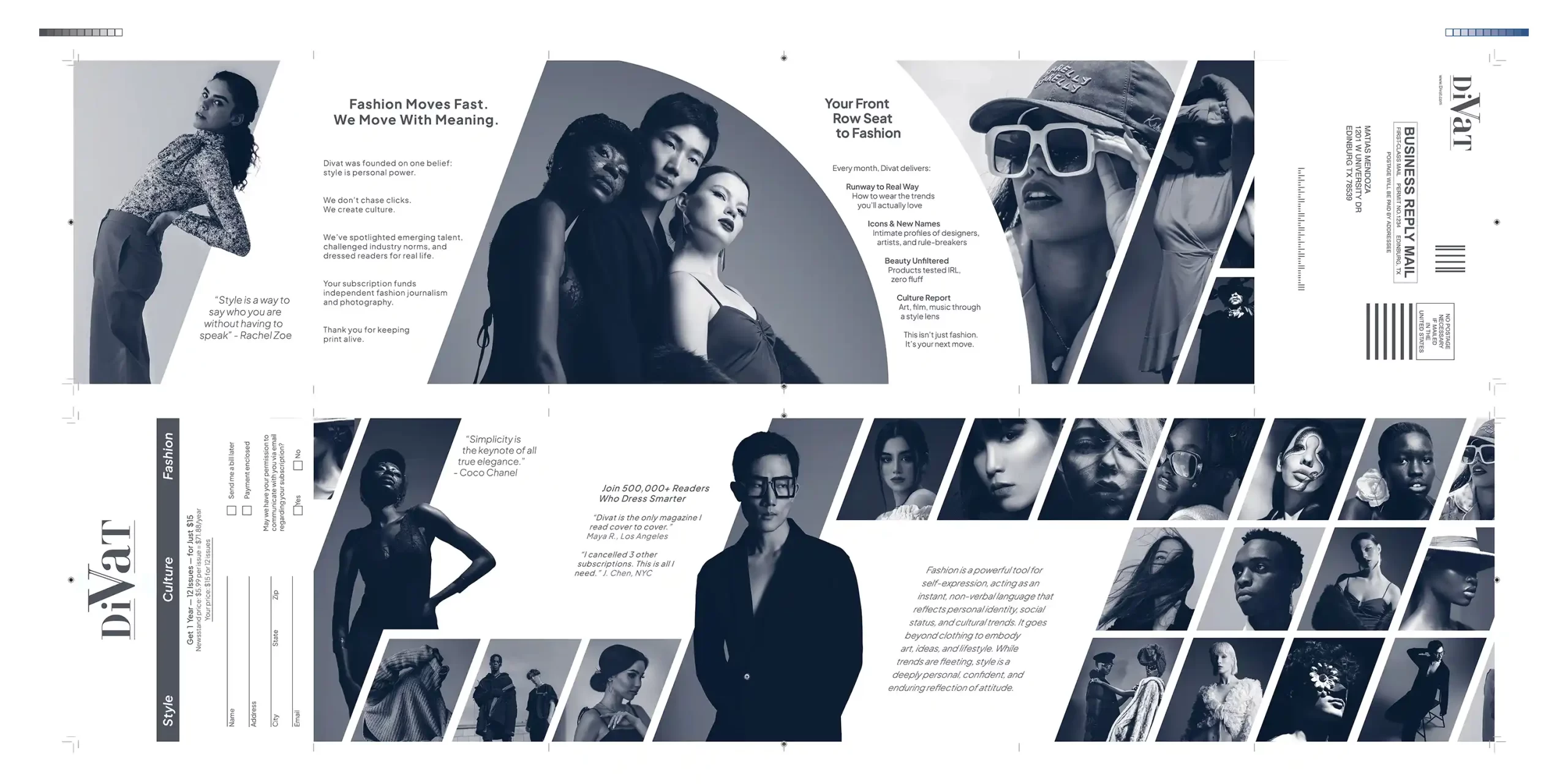
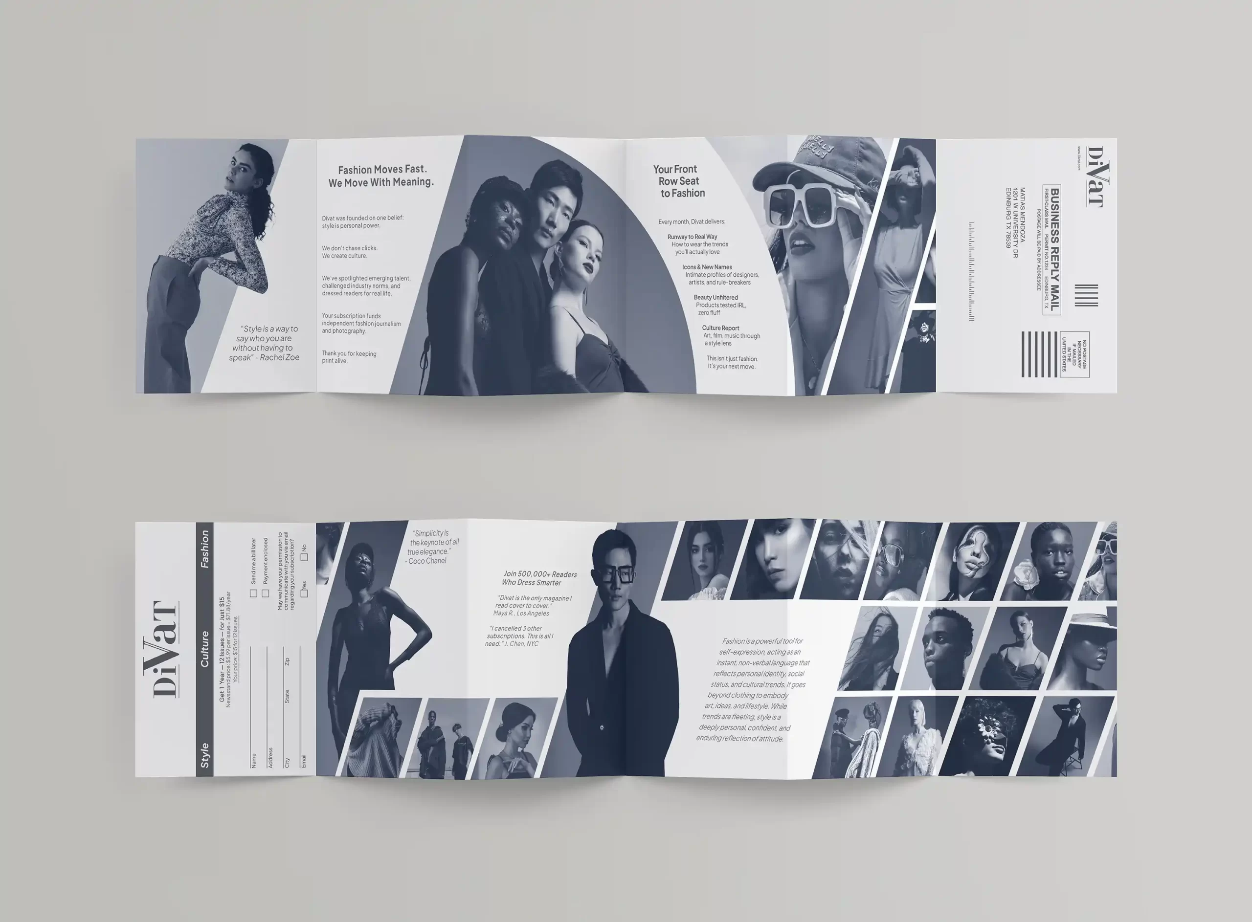
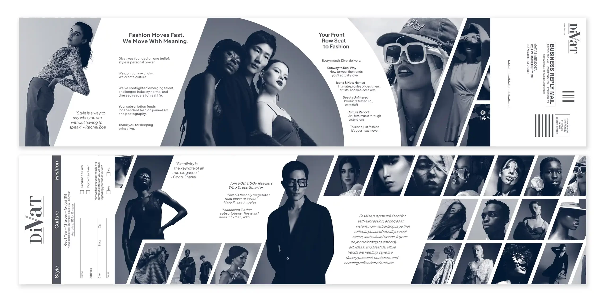
3RD: DIVAT Fashion BRM – Section I (20 Student Votes)
https://www.behance.net/gallery/249167081/Business-Reply-Mail-Design-(BRM)
- 3 1st-Place Student Votes
- 1 2nd-Place Student Votes
- 4 3rd-Place Student Votes
- 3 4th-Place Student Votes
- 7 5th-Place Student Votes
- 2 6th-Place Student Votes
- Instructor’s Choice for Third Place
Excellent concept consistency and strong personality. The contemporary color palette and typography work very well together, giving the project a strong editorial personality and modern publication appeal. The project also makes fantastic use of shared column grids, modified column grids, and modular grid systems to organize both image framing and text content in a visually dynamic way. The overall layout feels highly eye-catching and cutting-edge. The mockup presentation is also extremely successful, as the folded layout presentation enhances the editorial realism and showcases the pacing and continuity of the design in a highly professional manner. Some areas feel slightly crowded, but the overall branding direction is very compelling. Highly recommend this work for UDA and ADDY submission.
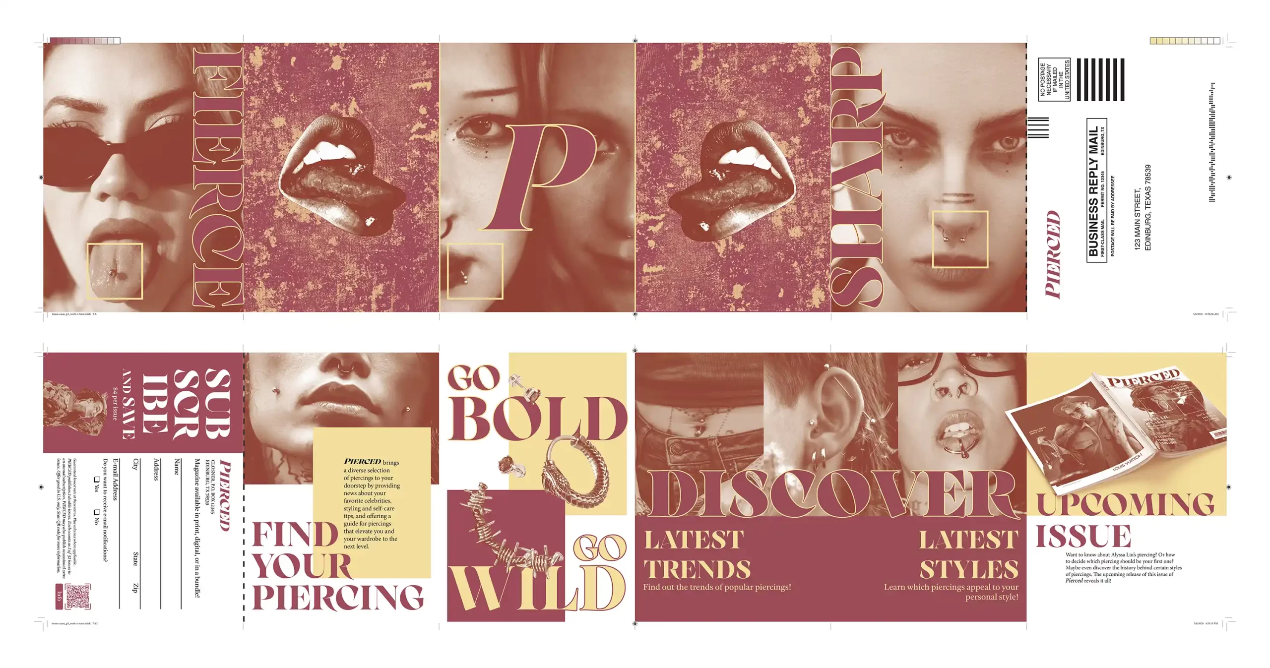
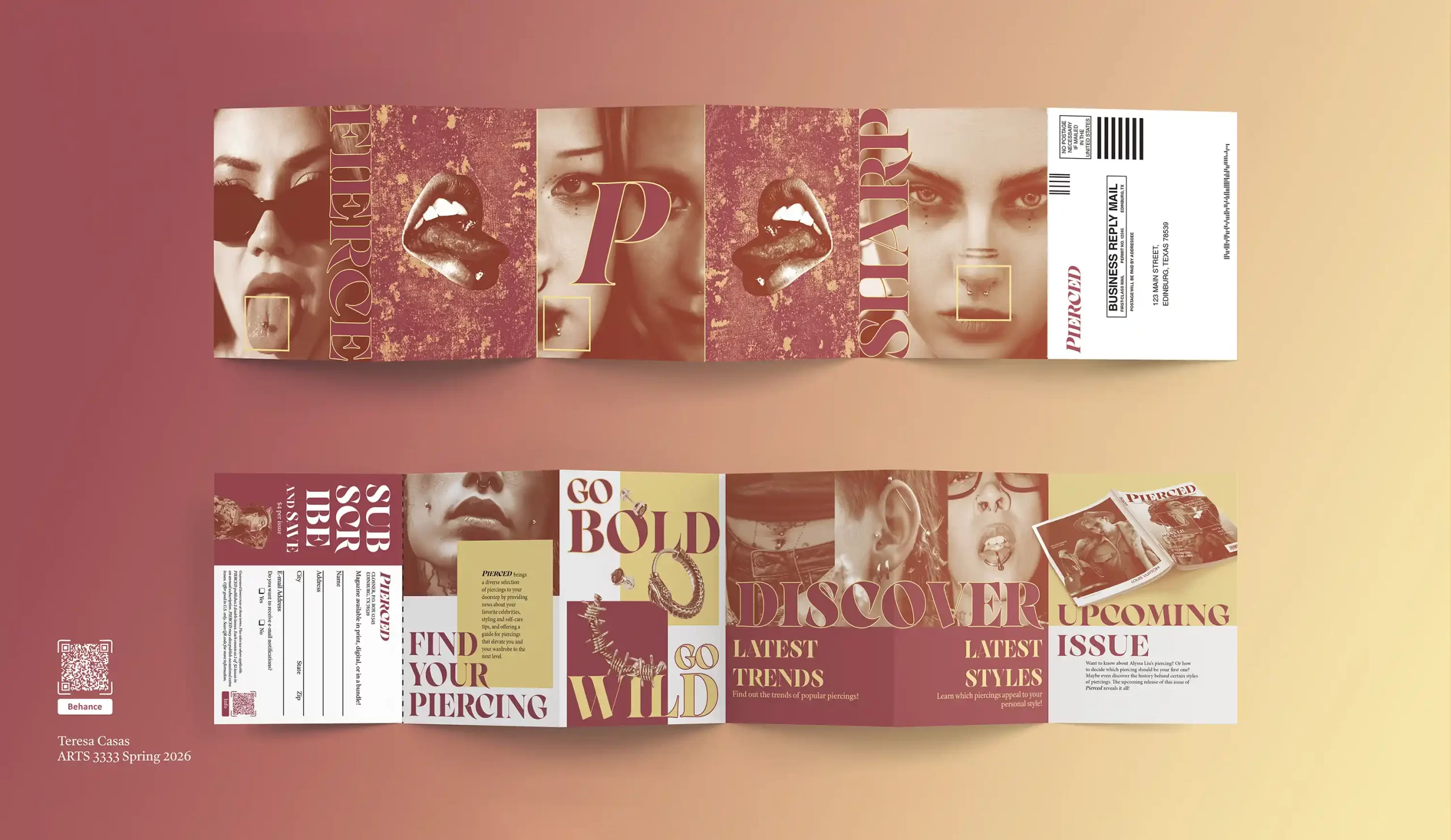
4TH: PIERCED BRM – Section I (10 Student Votes)
https://www.behance.net/gallery/248897611/Pierced-Business-Reply-Mail
- 1st-Place Student Vote
- 2 2nd-Place Student Votes
- 1 3rd-Place Student Votes
- 3 4th-Place Student Votes
- 2 5th-Place Student Votes
- 1 6th-PLace Student Votes
- Instructor’s Choice for Fourth Place
The project demonstrates great conceptual unity and a distinctive visual voice. The muted warm palette, elegant serif typography, and confident two-color printing approach create a polished fashion identity with strong contemporary appeal. The sequencing of imagery, spacing, and composition gives the piece an authentic editorial publication quality, while the balance between dense visual moments and quieter areas keeps the layout engaging without feeling overwhelming. The CTA section is thoughtfully organized and integrates naturally into the overall structure. The presentation layout, prepress layout, and mockup layout also work very well together as a dynamic system. The project feels commercially viable and aligns well with the level expected in competitive showcases such as the ADDY Awards and UDA competitions. Although a few sections could benefit from slightly more breathing room, the project successfully delivers a bold, refined, and highly marketable visual experience.
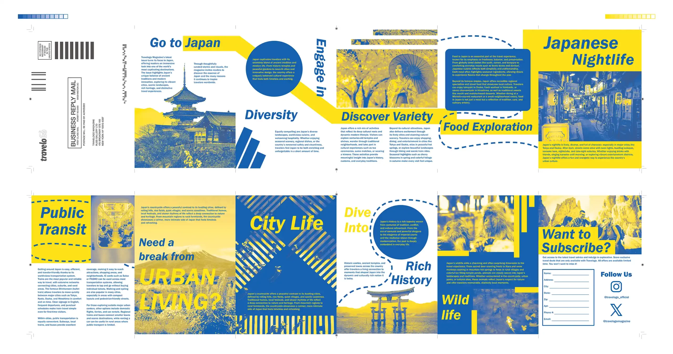
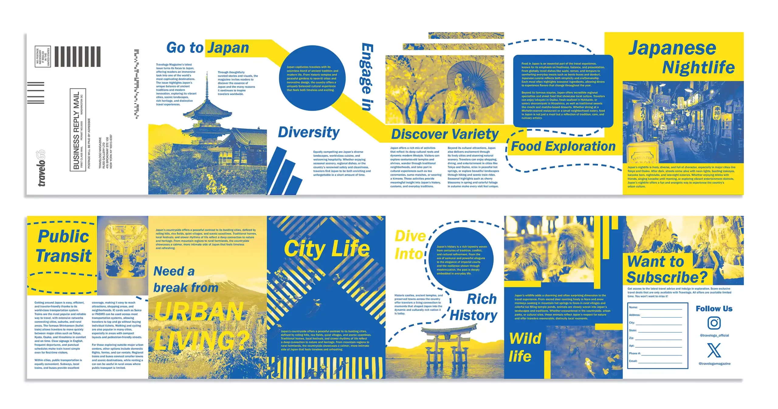
5TH: TravelGo Japan BRM – Section I (12 Student Votes)
https://www.behance.net/gallery/248733671/BRM-Travelogo-Magazine-BRM-Design
- 1st-Place Student Votes
- 3 2nd-Place Student Votes
- 3 3rd-Place Student Votes
- 2 5th-Place Student Votes
- 2 Sixth-Place Student Votes
- Instructor’s Choice for Fifth Place
Very energetic and creative use of bold blue and yellow color contrast with strong infographic-style movement throughout the layout, creating a visually engaging travel campaign atmosphere that works especially well for a younger audience. The layout feels dynamic and visually active, with several panels demonstrating strong compositional energy. The CTA panel currently feels slightly crowded and would benefit from additional breathing room, along with the inclusion of a company website or a QR code representing the brand website to further strengthen the realism and functionality of the BRM design. While some typography hierarchy and visual transitions between panels could still be adjusted for greater consistency, the overall concept remains clear, engaging, and commercially appealing. The project shows strong creative potential and still has a solid chance of receiving recognition in competitions such as the UDA and ADDY Awards.
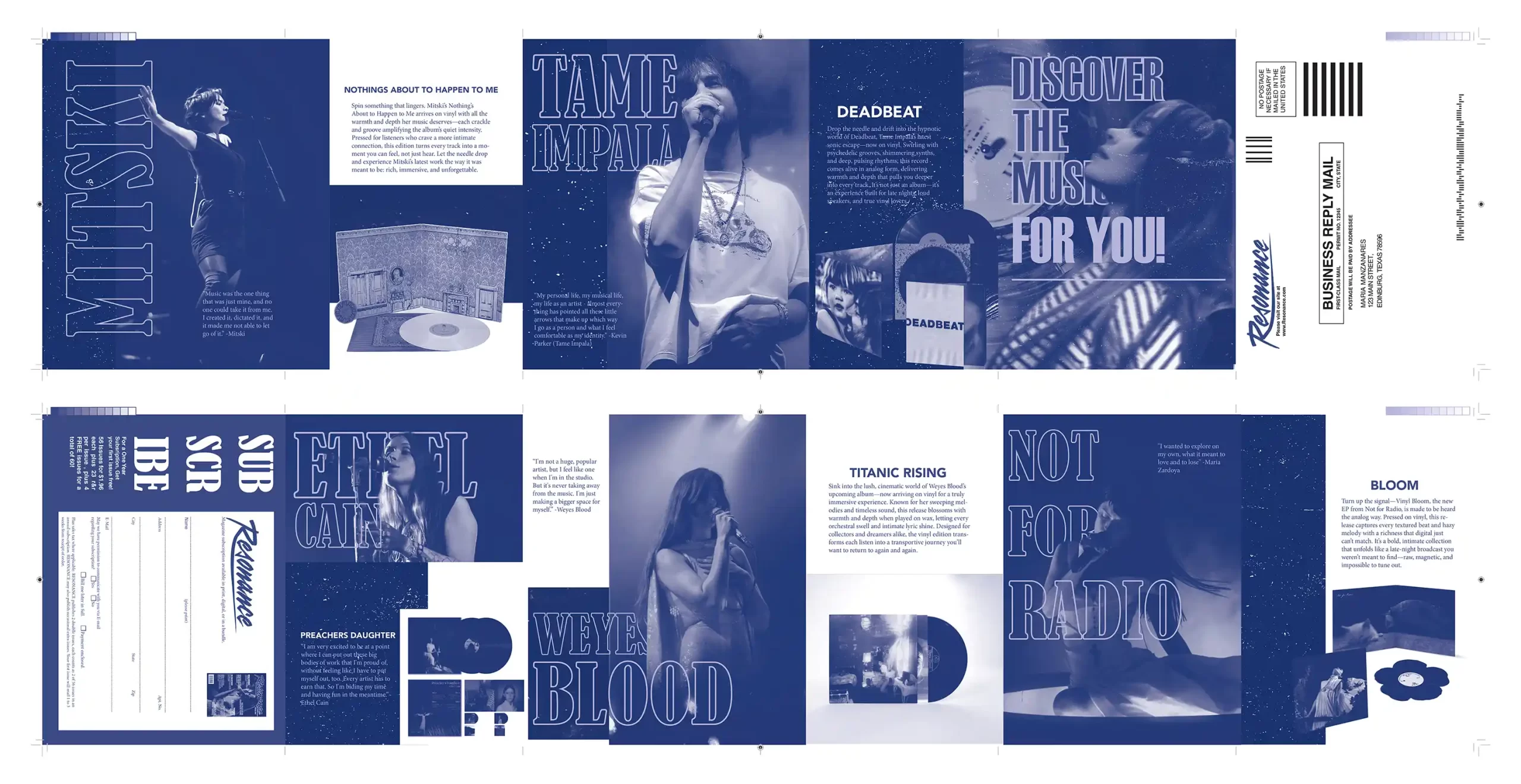
6TH: Resonance BRM – Section I (8 Student Votes)
https://www.behance.net/gallery/249118933/Resonance-Business-Reply-Mail
- 2 3rd-Place Student Votes
- 2 4th-Place Student Votes
- 4 5th-Place Student Votes
- Instructor’s Choice for Sixth Place
Resonance demonstrates a highly mature and cohesive design system. From typography, grid control, spacing, and solid two-color process presentation, the entire project feels close to a professional editorial campaign level. The visual language remains consistent across all panels, creating a unified brand world without noticeable stylistic breaks. The limited color approach is handled with strong control, giving the design a refined, contemporary, and polished visual identity. The balance between white space, visual density, image transitions, and text placement feels especially well managed, allowing the layout to remain dynamic while still feeling clean and organized. Overall, Resonance feels like a high-level fashion/editorial publication with strong potential for UDA and ADDY recognition. One area that could be improved further is the CTA section, which could benefit from slightly stronger visual emphasis and a clearer call-to-action hierarchy to enhance communication and audience engagement.
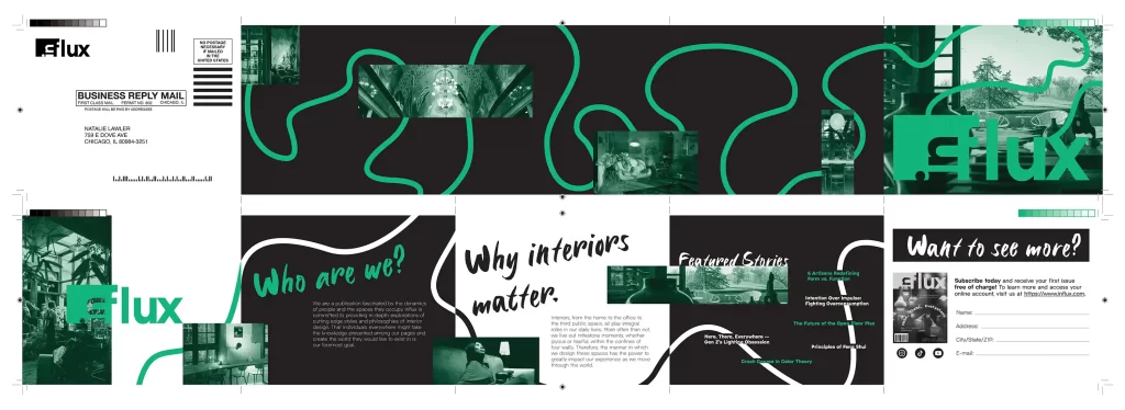

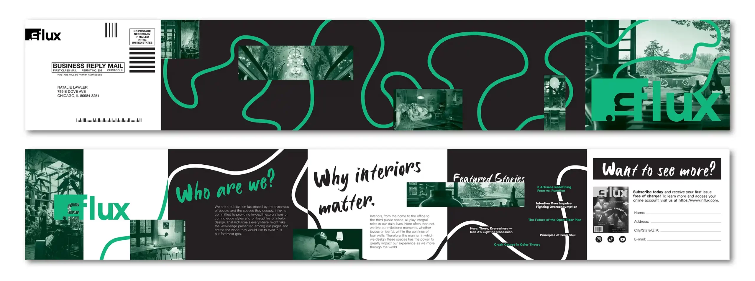
7TH: Influx BRM – Section II (9 Student Votes
https://www.behance.net/gallery/249076337/Influx-Magazine-Business-Reply-Mailer
- 4 2nd-Place Student Votes
- 3 4th-Place Student Votes
- 2 6th-Place Student Votes
- Instructor’s Choice for Seventh Place
Influx BRM demonstrates a bold and energetic editorial direction with strong contemporary publication appeal. The project uses dynamic image cropping, layered compositions, expressive typography, and double spot color handling to create strong visual momentum throughout the experimental design layout. The pacing between panels feels engaging and innovative, giving the publication a confident contemporary identity, while the CTA integration and overall layout structure support the campaign effectively. The directional path system could feel slightly smoother and benefit from a few additional supporting graphic elements or annotations to strengthen continuity and reduce some empty transitional areas. A few sections could also use slightly stronger hierarchy control for improved consistency. Overall, the project remains highly creative, visually compelling, and commercially appealing, with strong potential for recognition in competitions such as the UDA and ADDY Awards with further minor layout refinement.
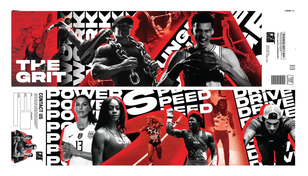
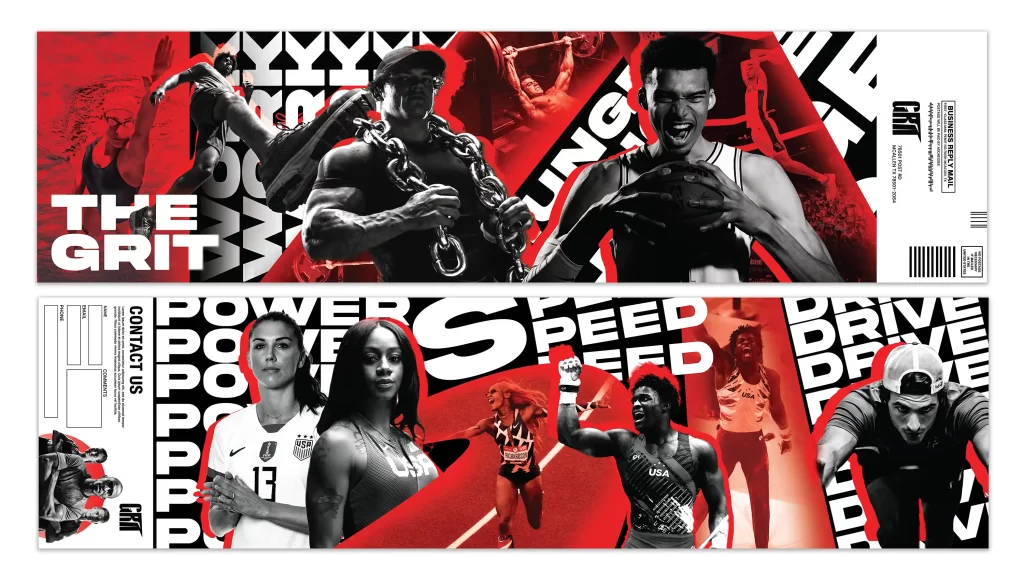
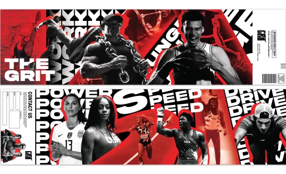
8TH: Sports Campaign BRM – Section I (10 Student Votes)
https://www.behance.net/gallery/249191839/GRIT-P3
- 4 1st-Place Student Votes
- 3 2nd-Place Student Votes
- 1 3rd-Place Student Vote
- 1 5th-Place Student Vote
- 1 6th-Place Student Vote
- Instructor’s Choice for Eighth Place
This project demonstrates a highly energetic and visually powerful campaign direction with strong contemporary sports branding appeal. The use of high contrast imagery, aggressive typography, layered compositions, and dynamic red accents creates fantastic visual intensity throughout the layouts. The focal hierarchy feels bold and engaging, and the overall campaign identity has a strong competition level presence suitable for UDA or ADDY Awards submissions. One area that could be further improved is the tonal consistency of the imagery system, as some image treatments feel slightly mixed rather than fully unified within a single visual tone. A few sections could also benefit from slightly cleaner spacing and hierarchy control to improve readability in denser areas. Overall, the project is extremely impactful, commercially appealing, and visually memorable.
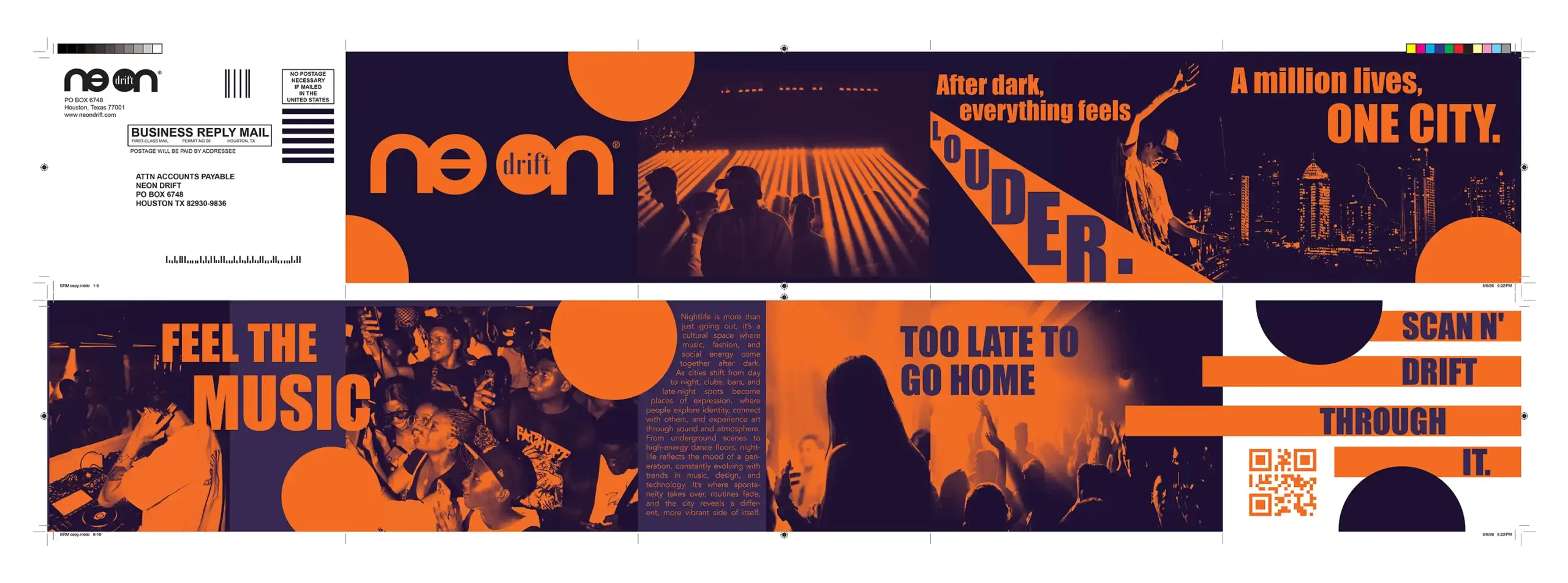
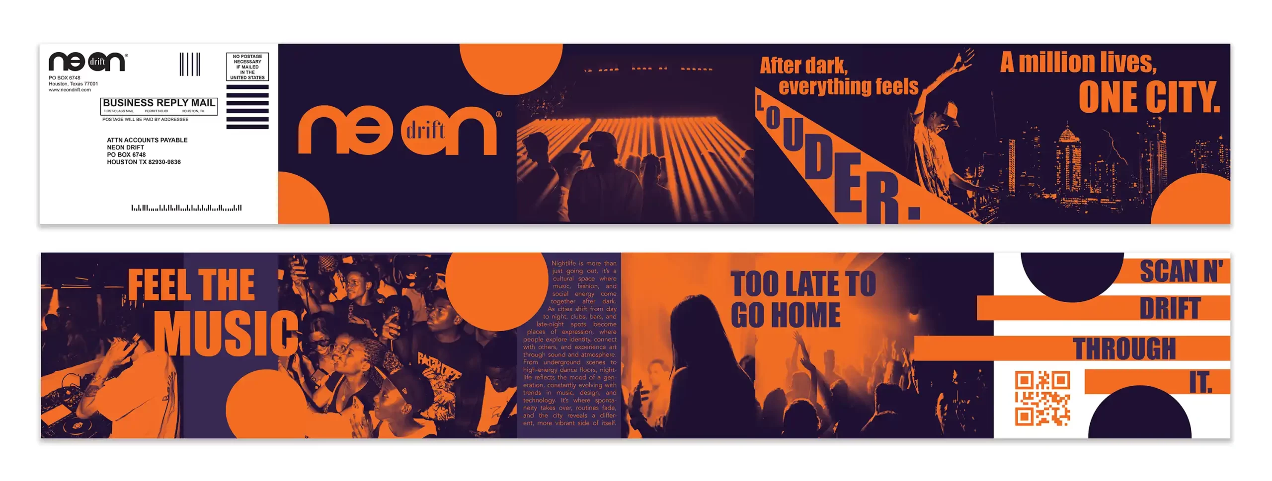
9TH: Neon Drift BRM – Section II (10 Student Votes)
https://www.behance.net/gallery/248902867/BRM-Project
- 3 1st-Place Student Votes
- 1 2nd-Place Student Vote
- 2 3rd-Place Student Votes
- 2 4th-Place Student Votes
- 2 6th-Place Student Votes
- Instructor’s Choice for Ninth Place
This project presents a clean and impressive campaign identity with a strong contemporary nightlife aesthetic. The orange and purple color palette creates a memorable visual system, while the typography and layout structure feel organized, polished, and commercially effective. The project successfully communicates atmosphere and branding consistency across the entire composition. One area that could be further developed is the variation within the geometric design language, as some circular and horizontal graphic elements begin to feel slightly repetitive throughout the layout. Certain areas could also benefit from additional layering, scale contrast, or visual tension to create a stronger sense of excitement and visual impact. Overall, the campaign is well designed, professional, and visually cohesive with a strong branding direction. After slight refinement and further development, the project has strong potential to become award winning work for competitions such as the UDA Idea Design and ADDY Awards.
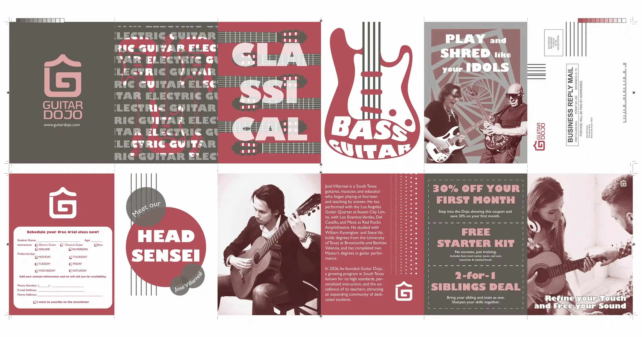
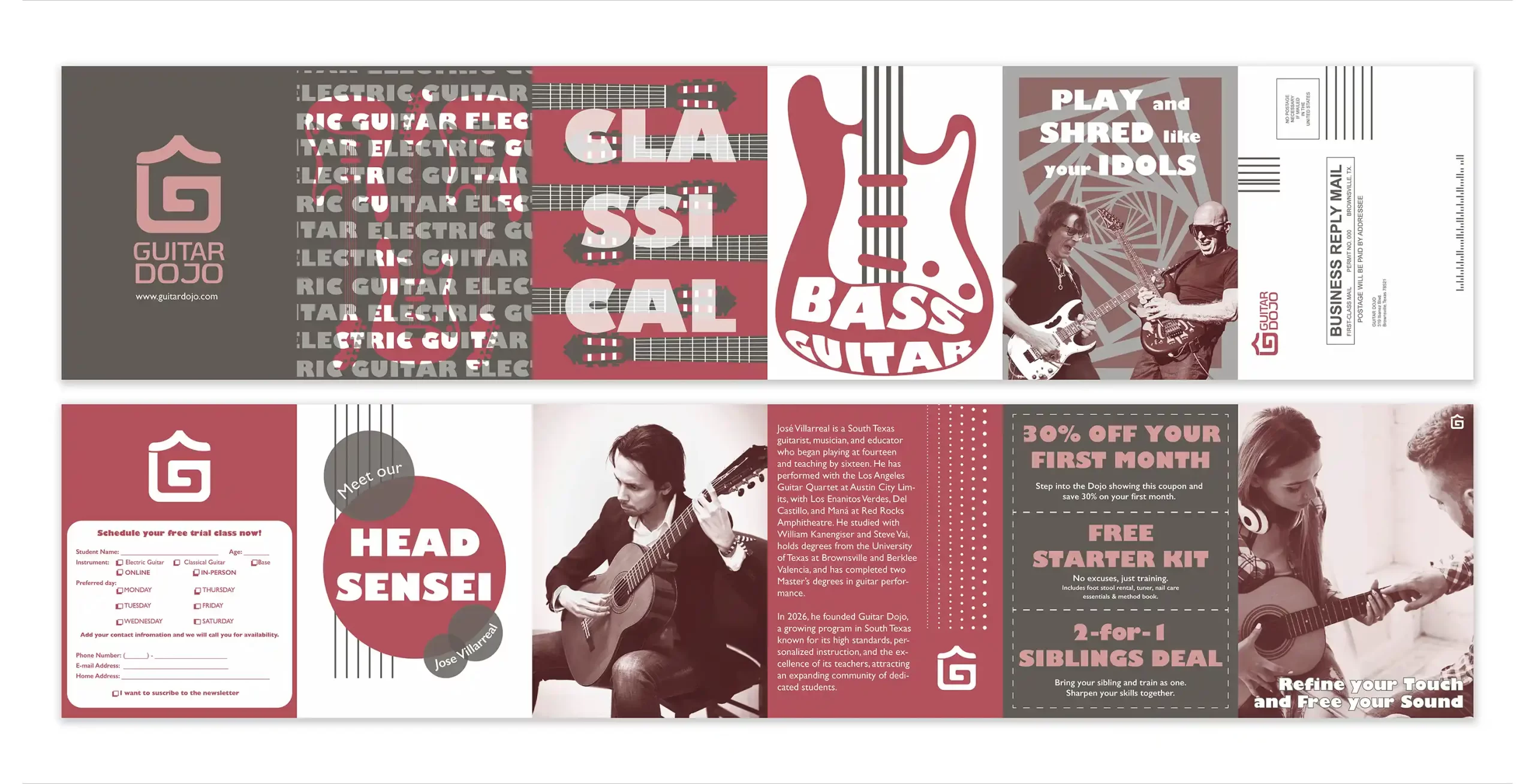
10TH: Guitar Dojo BRM – Section I (9 Student Votes)
https://www.behance.net/gallery/248875081/BRM-Guitar-Dojo?platform=direct
- 3 1st-Place Student Votes
- 1 2nd-Place Student Vote
- 1 3rd-Place Student Vote
- 2 4th-Place Student Votes
- 2 6th-Place Student Votes
- Instructor’s Choice for Tenth Place
This project demonstrates a bold and visually aggressive campaign direction with strong contemporary music and street culture aesthetics. The use of layered typography, high contrast imagery, dynamic cropping, and expressive composition creates excellent visual energy throughout the layout. The campaign feels highly engaging and emotionally intense, with strong competition level presence and a memorable visual identity. The integration between typography and imagery is especially successful, helping the project feel immersive and impactful. One area that could be further refined is the hierarchy control in several denser sections, where certain visual elements begin competing for attention simultaneously. A few transitions between layouts could also benefit from slightly cleaner spacing and pacing refinement. Overall, the project is visually powerful, commercially appealing, and highly memorable with strong potential for recognition in competitions such as the UDA and ADDY Awards.
Dear Students,
Thank you all for your hard work, creativity, and dedication throughout this BRM project. The overall quality of this semester’s final projects was extremely impressive, and I am very proud of your performance and growth as designers. The BRM project was designed to help you develop a stronger understanding of imposition layout systems, spot color printing techniques, and toned image creation through PMS duotone and simulated duotone color processes within a professional print production workflow.
It was honestly very challenging to rank the projects because the overall level of work was highly competitive. As you may have noticed, there were many additional strong projects that were not included in the final ranking list. Several works from both sections of this class demonstrate strong potential for submission to the UDA Idea Design 2026 International Design Competition in November and the American Advertising Awards in December 2026. I will also further select two projects as UTRGV sponsored entries for the ADDY Awards submission. Seeing your success, creative development, and professional growth is one of the greatest rewards for me as a designer educator.
I truly appreciate your effort, passion, and commitment throughout the semester. I would also be very happy if you would like to connect with me on Behance as part of your professional creative network. https://www.behance.net/pxstudio
Stay creative, stay inspired, and enjoy your summer.

Professor Ping Xu
May 15, 2026