Course Introduction (Syllabus)
Class Meeting-3: 1:55 PM – 4:35 PM, Wednesday, September 10, 2025
Class Meeting-4: 1:55 PM – 4:35 PM, Monday, September 15, 2025
Class Meeting-5: 1:55 PM – 4:35 PM, Wednesday, September 17, 2025
Classroom: Visual Arts Bldg 1.112
Final Exam Day: 1:15 PM – 3:00 PM, December 15, 2025
https://www.utrgv.edu/ucentral/_files/summer-2025-final-exam-schedule_12-17-24.pdf
Lecture Topics & Activities for the Week-2 & 3
- Color Choices for Brand Identity (9/10, 9/15)
- Size Variation for Brand Identity (9/10, 9/15)
- Guidelines for Logo Specifications (9/10, 9/15)
- AI Design Rules for Logo Design (9/15)
- Project Brief-1B: Branding POP (9/15)
- Brainstorming for POP Design (9/15)
- POP Design Review and Improvement (9/17)
- POP Design Final Review (9/24, 9/29)
- POP Design Due 10/1)
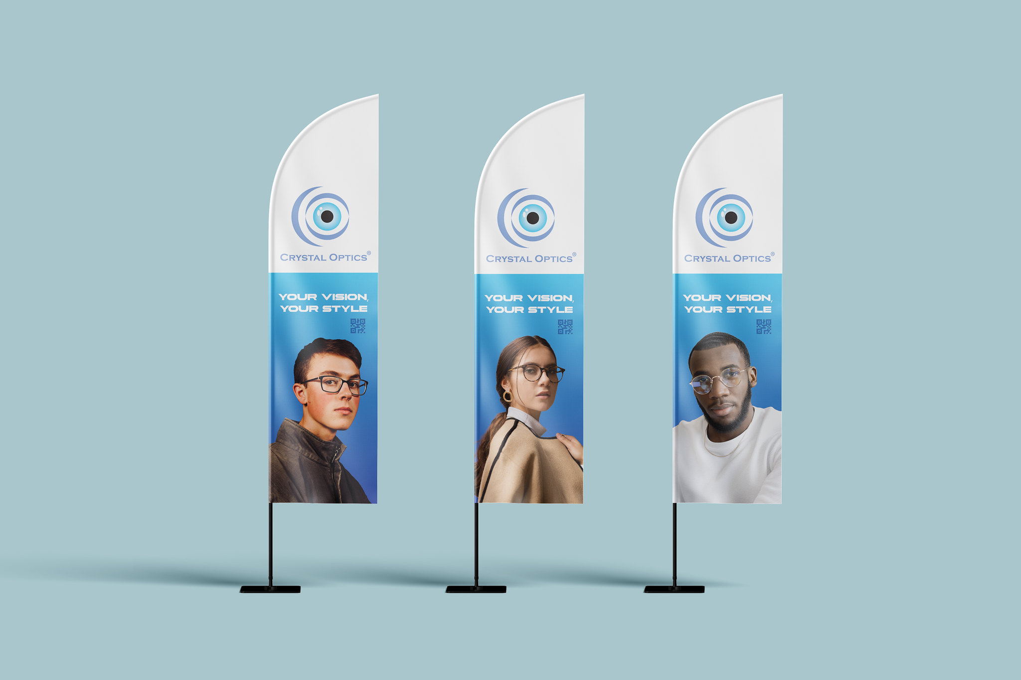
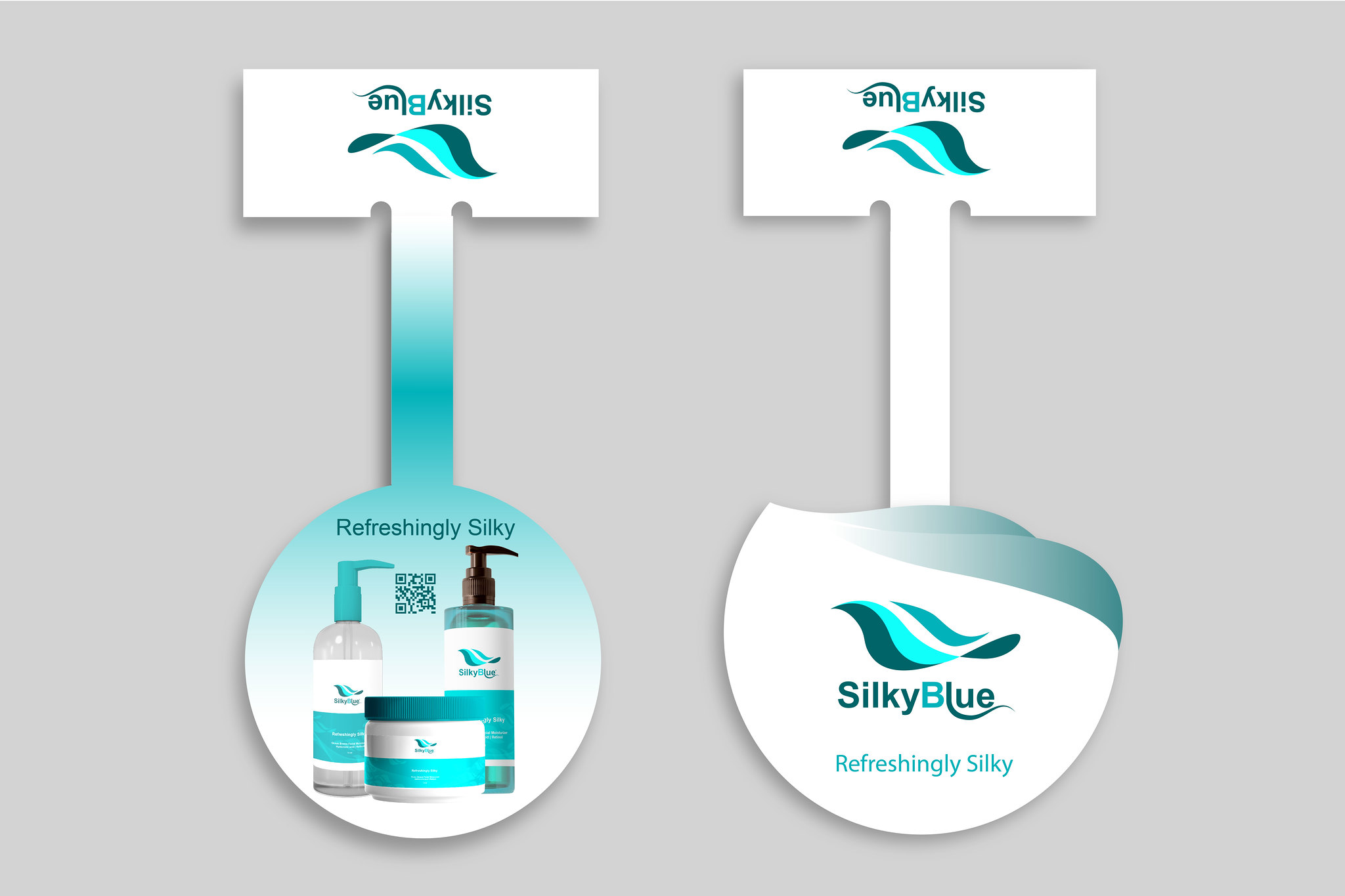
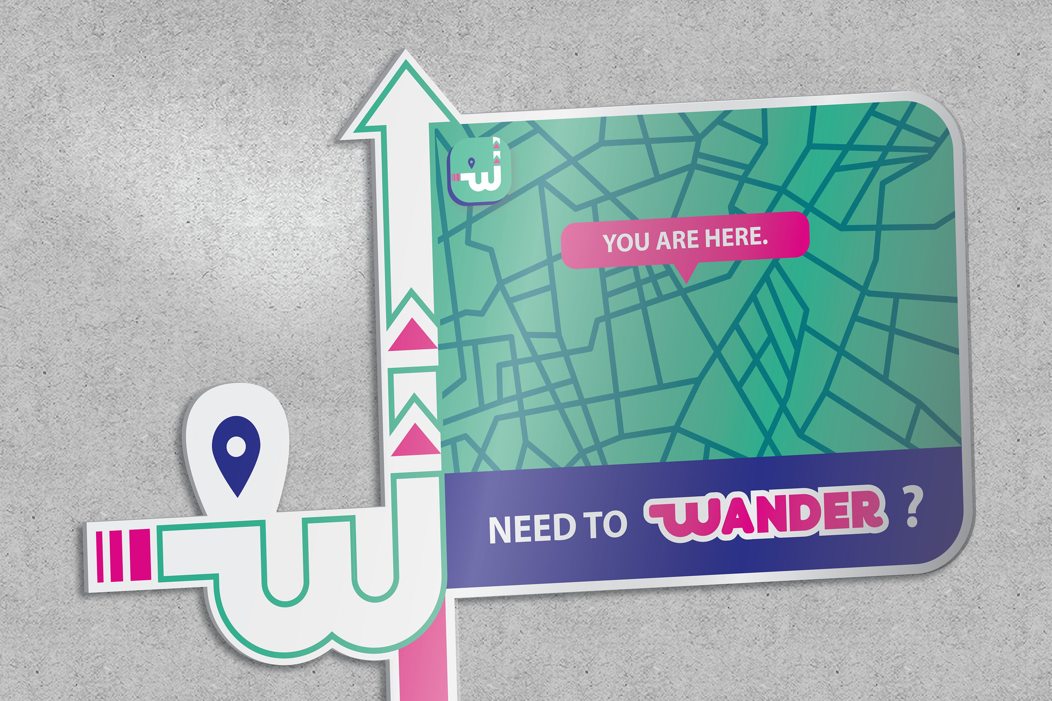
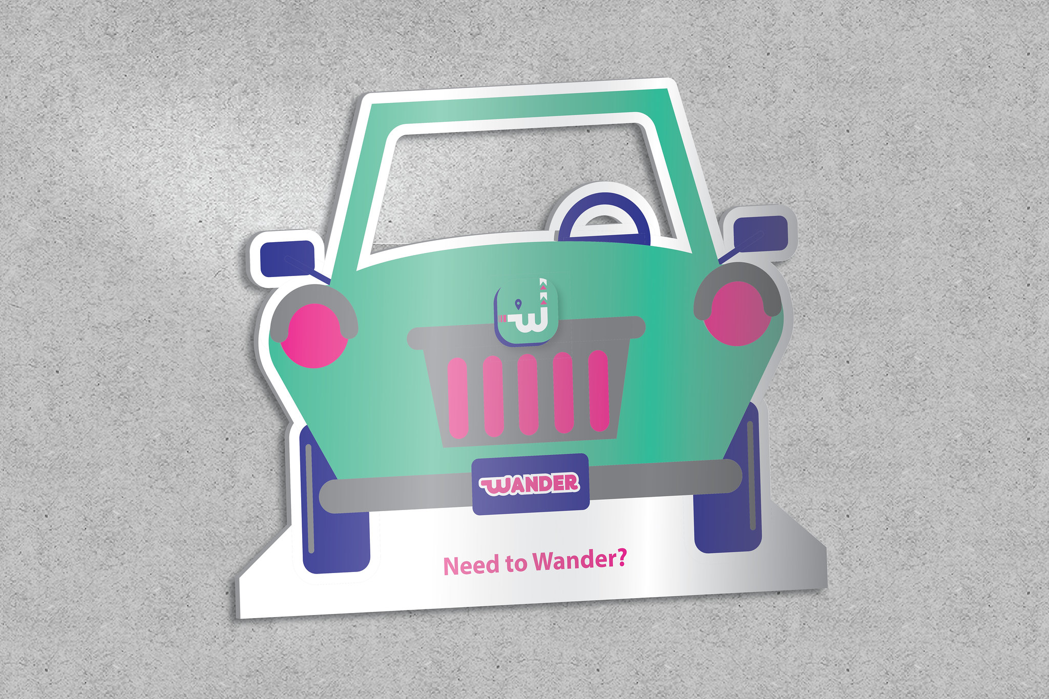
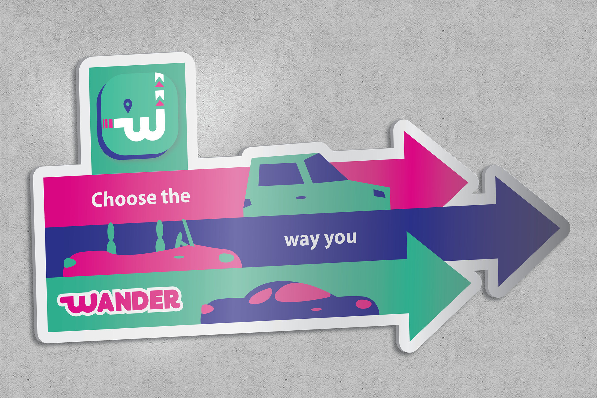
The Selection of your Branding Campaign Logo
The choice of the branding campaign logo will be based on two key factors:
- The Most Identifiable Brand Identity: This logo should create the most memorable visual representation of the brand.
- The Most Marketable Brand Identity: This logo should facilitate a universal brand image across various media channels, ensuring the effectiveness of brand promotion in the marketing context.
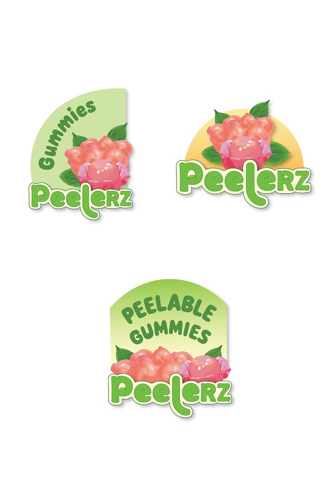
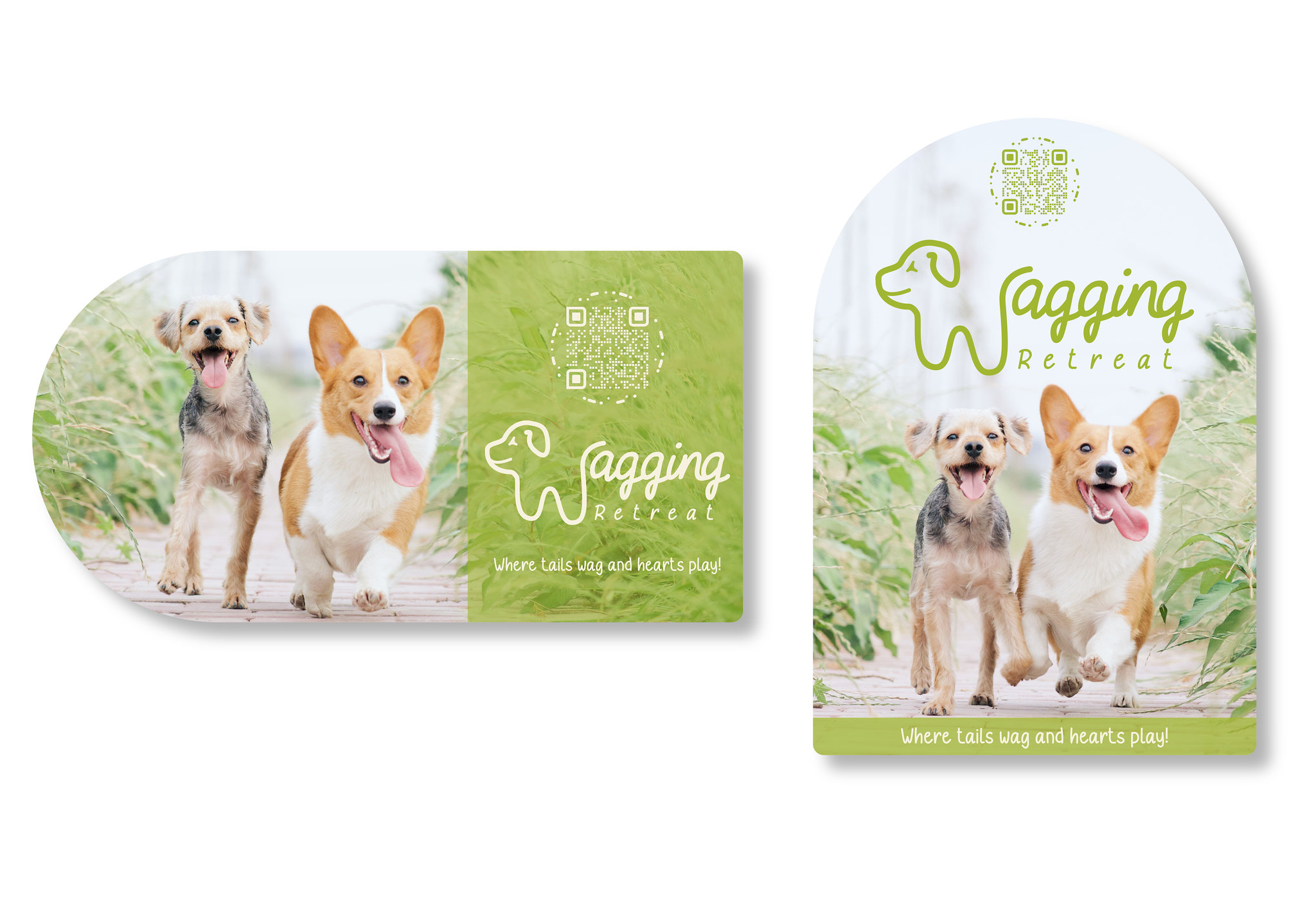
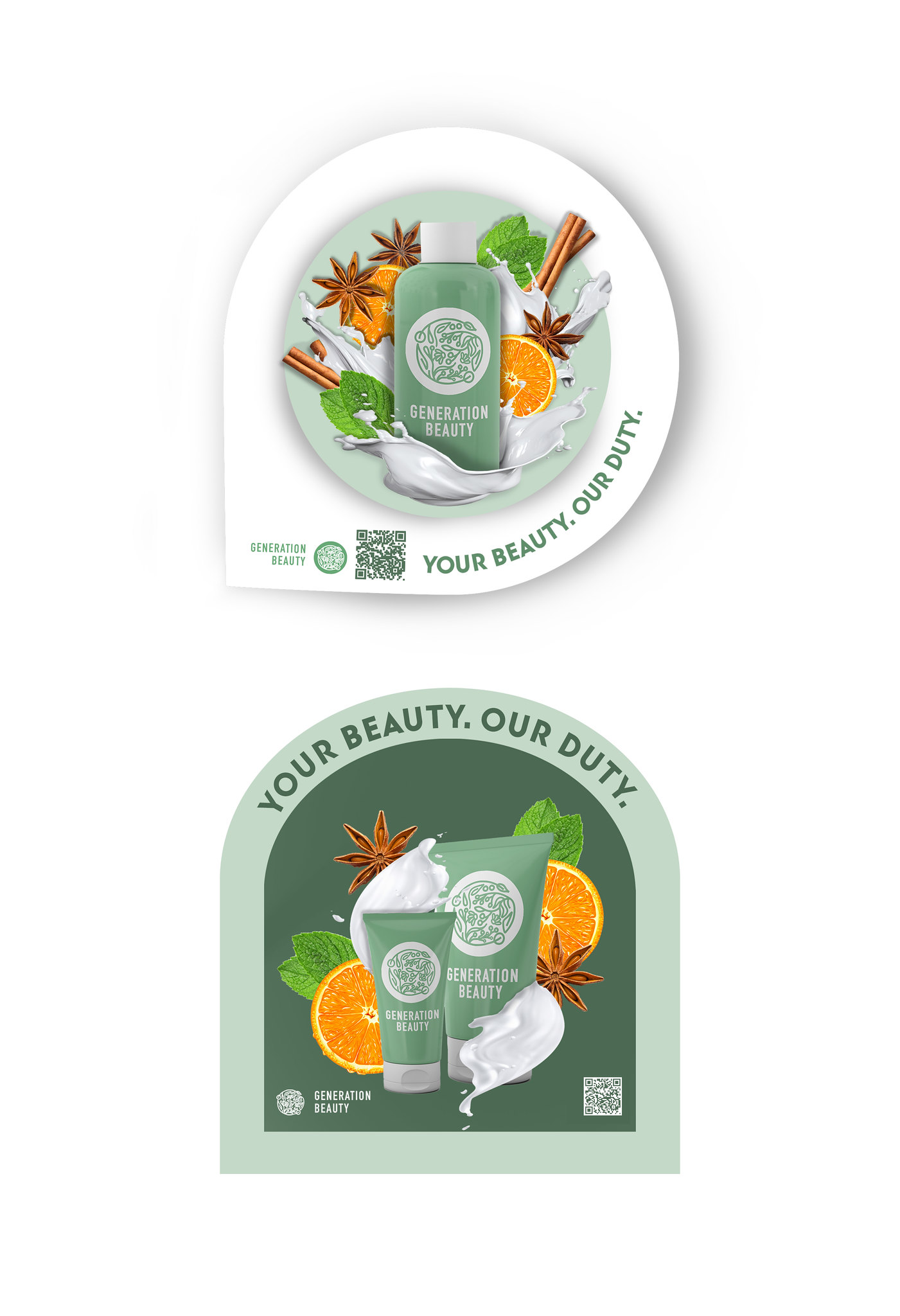
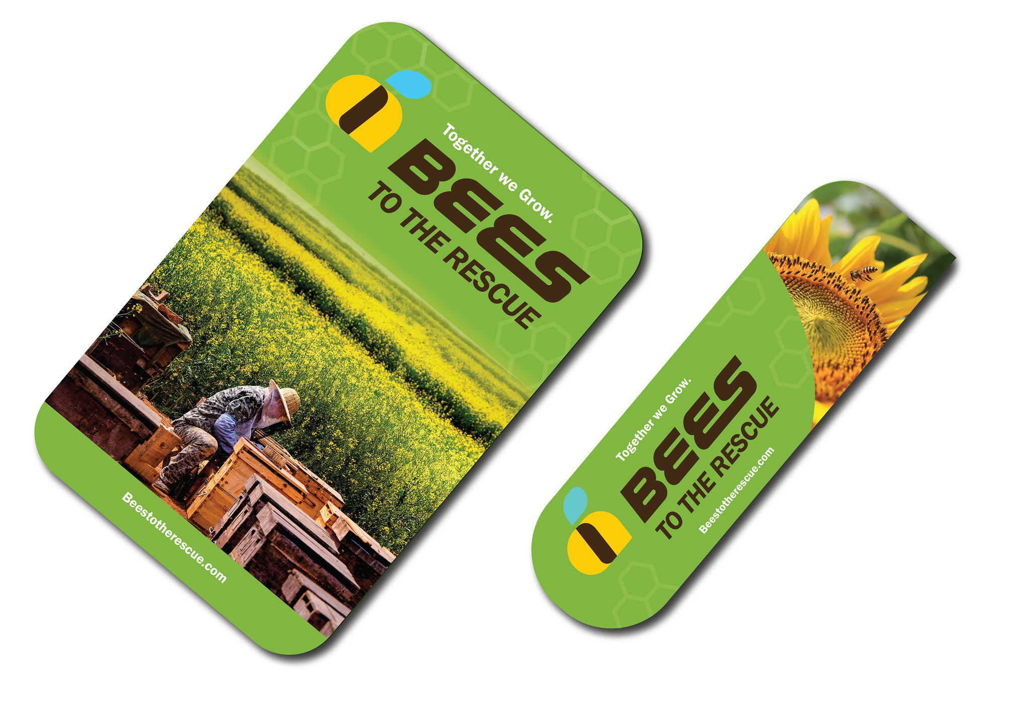
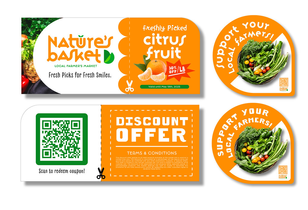
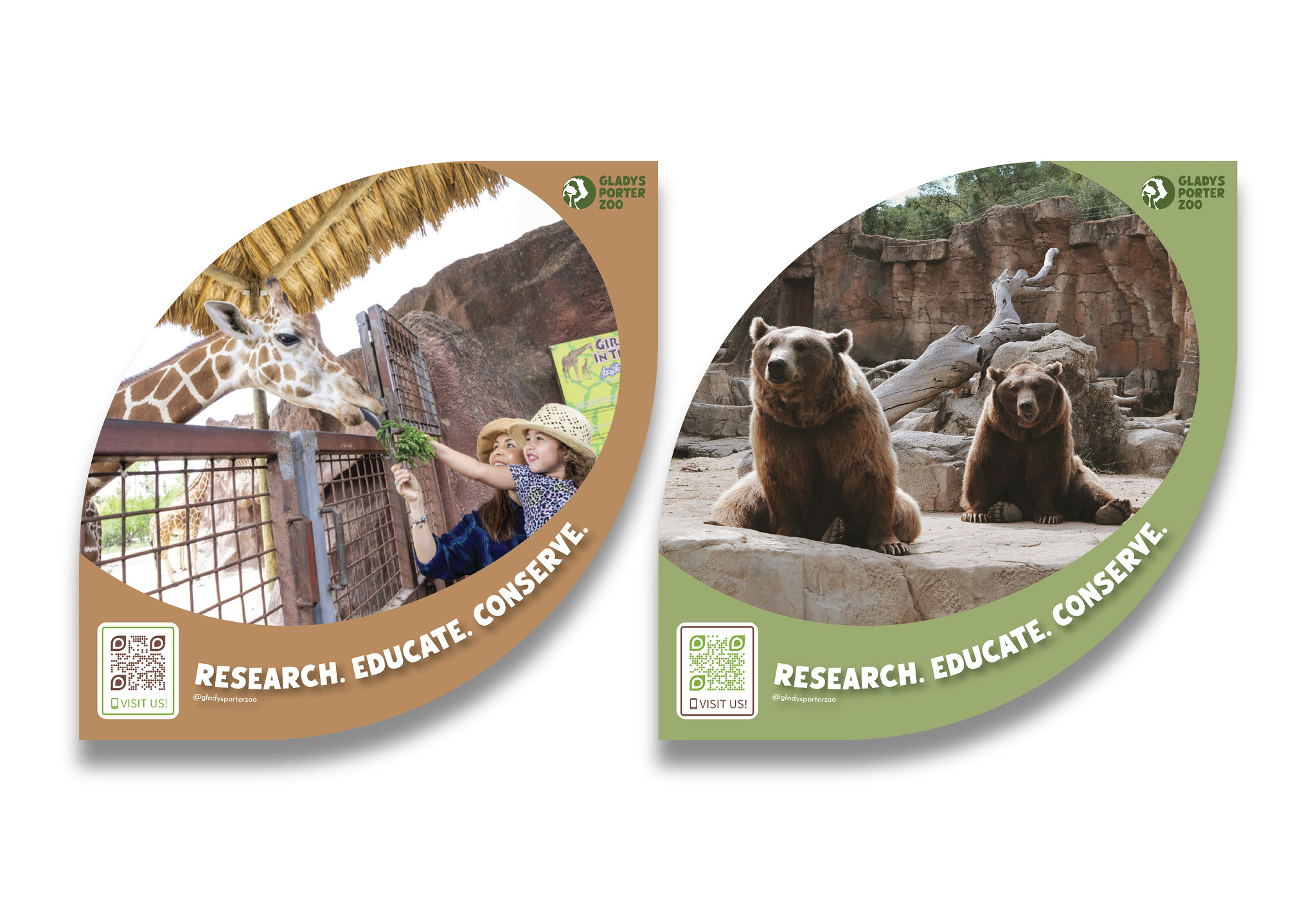
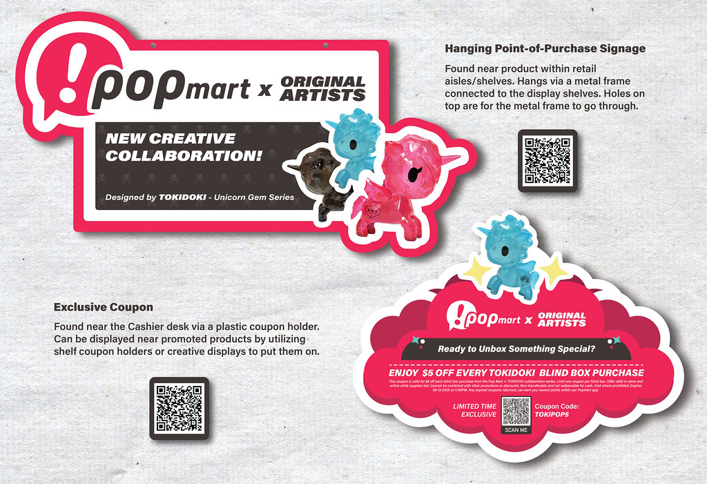
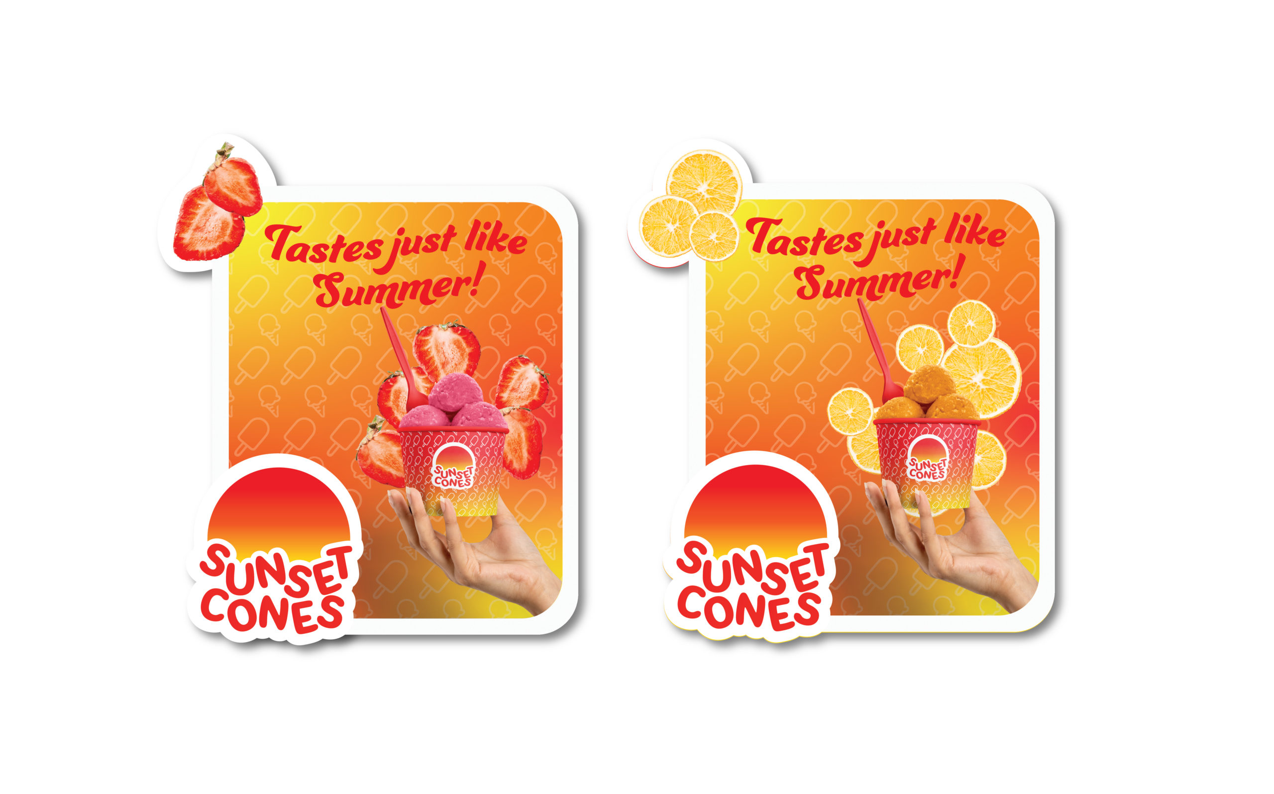
Project Brief-1B: Branding POP (50 Points Possible)
Select one of the brand identities developed in Project-1A and craft two distinct point-of-purchase (POP) designs. These POP displays will serve the dual purpose of promoting the selected brand and its products. In both designs, please incorporate organic-shaped die-cut elements, which will add a unique and eye-catching visual appeal to the displays.
Layout Size Options:
- 16″X24″ for portrait or landscape layout if you prefer to create a POP campaign with three POP designs. (Optional)
- 19″X13″ for portrait or landscape layout if you prefer to create a POP campaign with two POP designs.
- Date Range of the Project: September 10 – October 1, 2025 (2 Weeks)
- Project Due Date: October 1, 2025
Project’s Flickr Group
https://flickr.com/groups/pxstudio_advertising-design/
Key Word:
#Point of Purchase, #POP, #POS, #POS Design, #POS Advertising, #POS Design PSD Template, #Point of Sale
https://www.pinterest.com/pongfudge/posm-design/
Instore Marketing & Display – The Role of Graphic Design & Imagery
https://www.display.be/POP-graphic-design.html
What is a Point of Purchase (POP)
A point of purchase (POP) refers to the strategic placement of promotional materials by retailers or marketers in areas where customers are most likely to encounter them. These displays, whether printed or electronic, are typically positioned near merchandise in physical stores or prominently featured at the checkout area. In online retail, POP can manifest as virtual signs. The aim is to increase the likelihood of purchases by drawing attention to specific products or services. POP displays capitalize on moments when shoppers might not have predetermined decisions, effectively influencing their choices.
The primary purpose of these displays is to create a visually appealing shopping experience that highlights particular offers or brands. Retailers strategically situate these displays along customer pathways to enhance engagement and boost sales. By placing promotional items near related products, POP displays target customers already in a buying mindset, making it easier to sway their purchasing decisions.
The Role of POP Displays
Point of Purchase (POP) design plays a crucial role in marketing graphic design for several reasons. It serves as a powerful tool to influence consumer behavior and drive sales at the critical moment when a potential customer is making a purchase decision. Here are some key points highlighting the importance of Point of Purchase Design in marketing graphic design:
- Capture Attention: POP designs are strategically placed at the point of sale, such as store shelves, checkout counters, or product displays. These designs need to grab the attention of shoppers amidst a sea of products, advertisements, and distractions. Well-designed POP materials can help products stand out and pique curiosity.
- Increase Sales: Effective POP design can significantly boost sales. It can educate customers about product features, benefits, and promotions, making them more likely to make a purchase. Attention-grabbing graphics, persuasive copy, and enticing visuals can drive impulse buying and increase the average transaction value.
- Enhance Brand Visibility: POP materials reinforce brand identity and recall. Consistent branding across all marketing materials, including POP displays, helps create a strong brand presence in the minds of consumers. This increases the chances of repeat purchases and brand loyalty.
- Communicate Information: POP designs can convey essential information about products, such as pricing, product details, ingredients, usage instructions, and special offers. Clear and concise communication in these designs can assist customers in making informed decisions.
- Create Emotional Appeal: Well-crafted POP materials can evoke emotions and connect with customers on a personal level. Whether it’s through compelling imagery, relatable storytelling, or humor, emotional engagement can drive brand affinity and customer loyalty.
- Support Promotions and Seasonal Campaigns: POP designs are versatile and can be updated to align with seasonal promotions, special events, or product launches. This flexibility allows brands to stay current and relevant in the market.
- Cross-Selling and Upselling: Point of Purchase designs can also suggest complementary products or upgrades, encouraging customers to purchase more than initially planned. This can be especially effective in retail environments where impulse buying is common.
- Measure and Optimize: POP design’s impact on sales can be tracked and analyzed. Brands can use data from sales figures and customer feedback to refine their POP designs and marketing strategies continually.
- Competitive Advantage: In a competitive marketplace, innovative and eye-catching POP designs can give a brand a competitive edge. Unique and memorable displays can draw customers away from competitors’ products.
- Adapt to Different Retail Environments: POP designs can be customized to suit various retail environments, from supermarkets to boutique stores. Adapting the design to fit the specific context and target audience is key to its effectiveness.
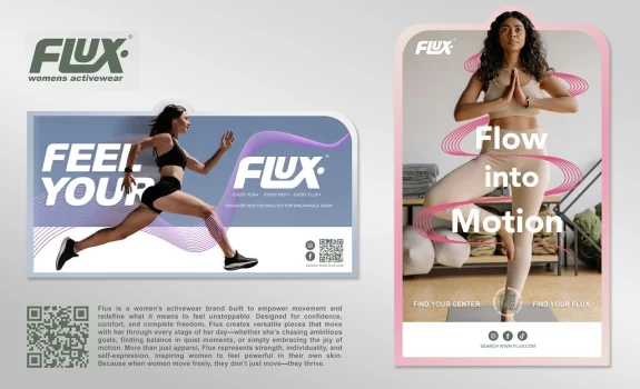
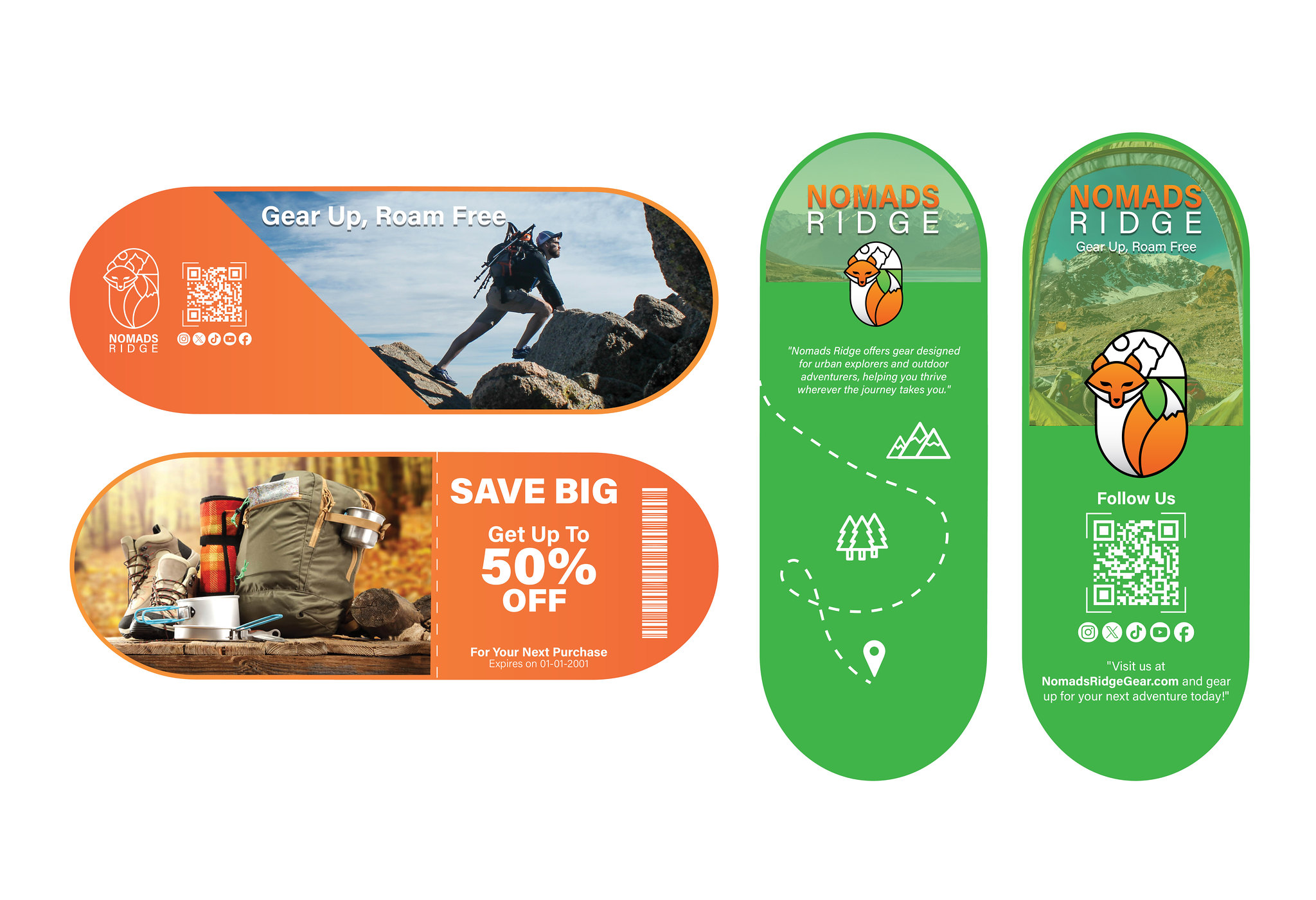
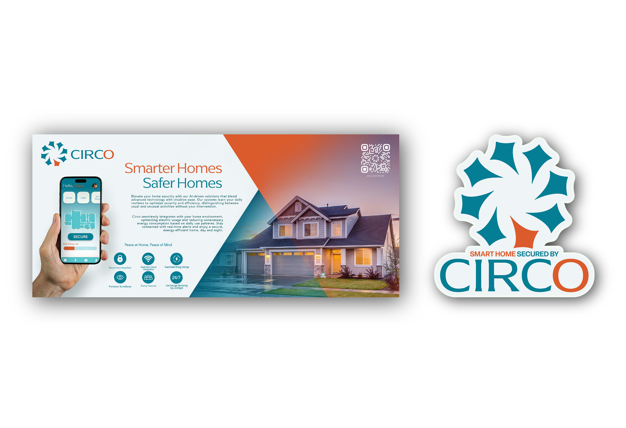
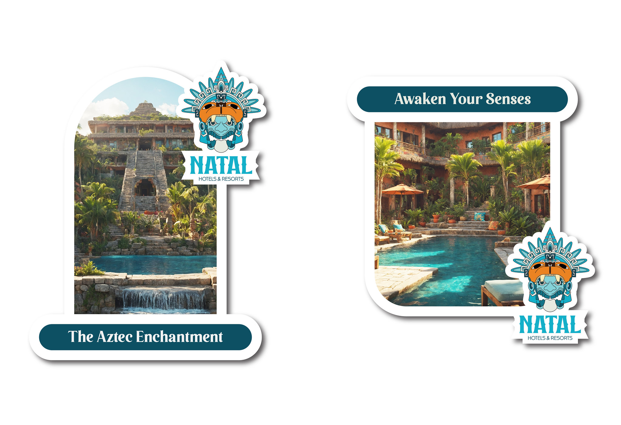
POP Design for Dual Promotions
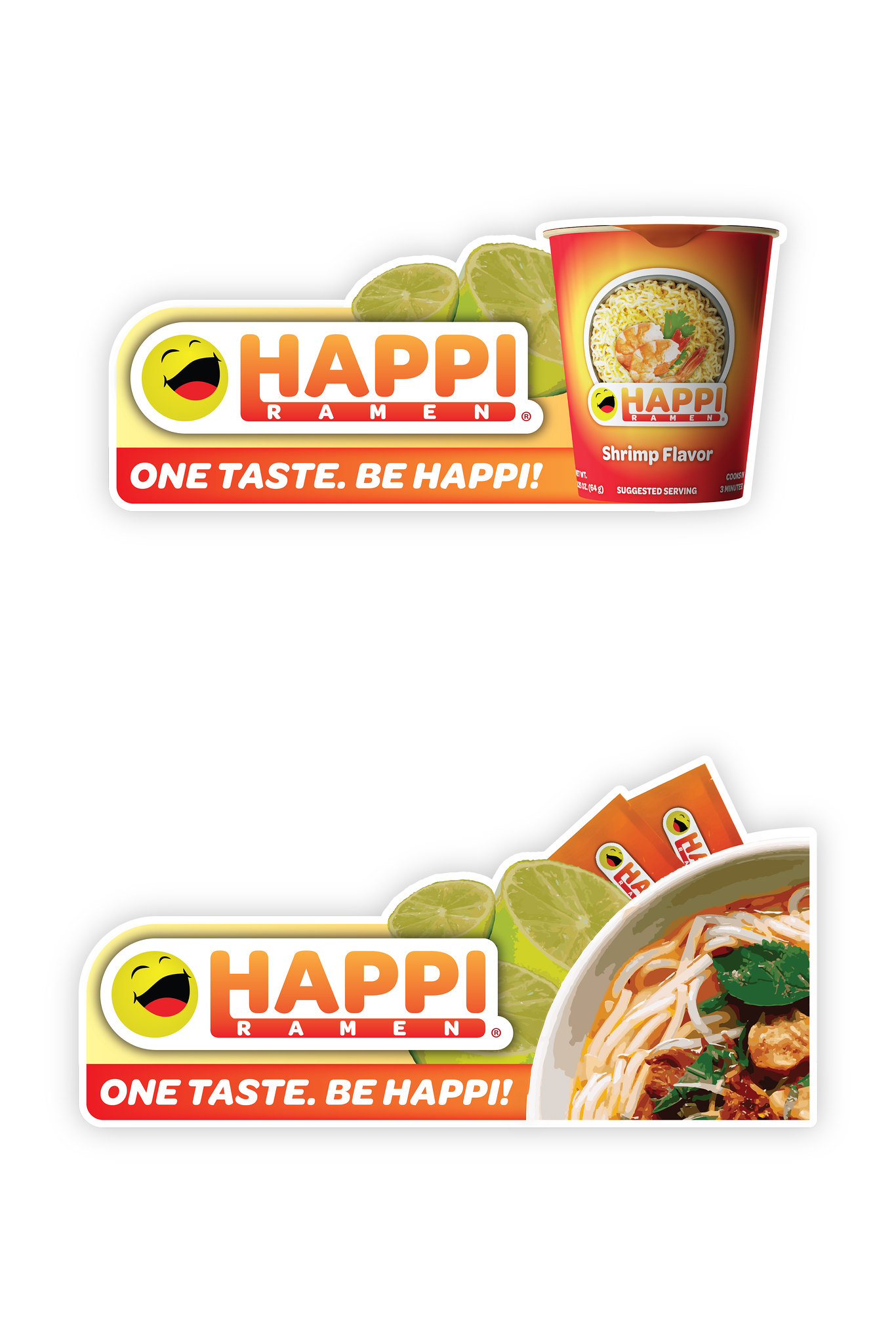
POP Display 1: Brand Promotion (See example below)
Design Concept:
For GreenGrove Organics’ brand promotion, you need create an eye-catching POP display that showcases the brand’s commitment to natural and organic ingredients. The display will have an organic leafy shape die-cut, symbolizing the brand’s connection to nature.
- Design Elements:
- Stand-alone cardboard display with a leaf-shaped die-cut design.
- A background image of a lush green forest to emphasize the organic nature of the products.
- Shelves with product samples, featuring a variety of GreenGrove Organics skincare items.
- Prominent brand logo and slogan.
- Messaging:
- “Discover the Beauty of Nature with GreenGrove Organics”
- “Naturally Derived Skincare for Radiant Skin”
- Highlight key product benefits: “Vegan,” “Cruelty-Free,” “No Harmful Chemicals”
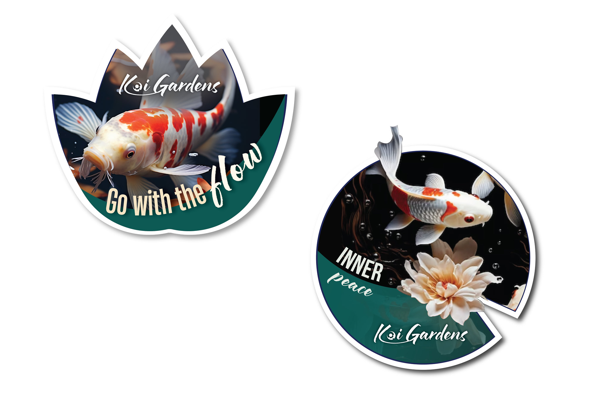
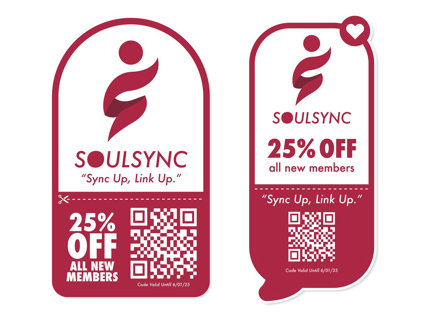
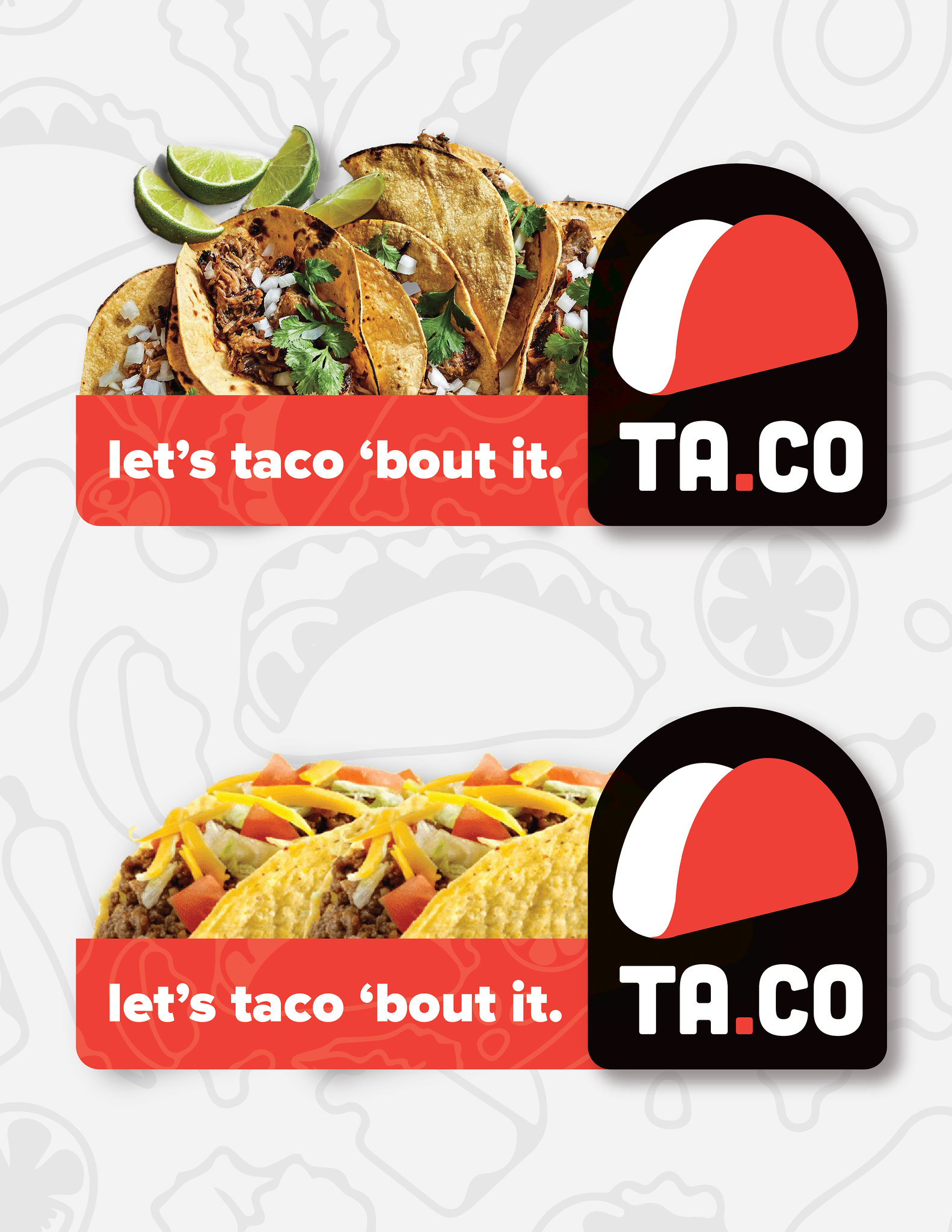
POP Display 2: Sales Promotion (See example below)
Design Concept:
For a sales promotion, we’ll create a dynamic POP display with an organic, flowing shape to draw attention to a limited-time offer on GreenGrove Organics’ products.
- Design Elements:
- Curved, wave-like cardboard display with die-cut elements resembling leaves or water droplets.
- Feature product bundles or discounted items prominently on the display.
- Striking color scheme to evoke freshness and savings.
- Call-to-action section with “Limited Time Offer” and “Shop Now” messaging.
- Messaging:
- “Unleash the Power of Organic Beauty”
- “Exclusive Savings – Hurry, Limited Time Offer!”
- Highlight specific promotions: “Buy One Get One 50% Off,” “Free Gift with Purchase,” etc.
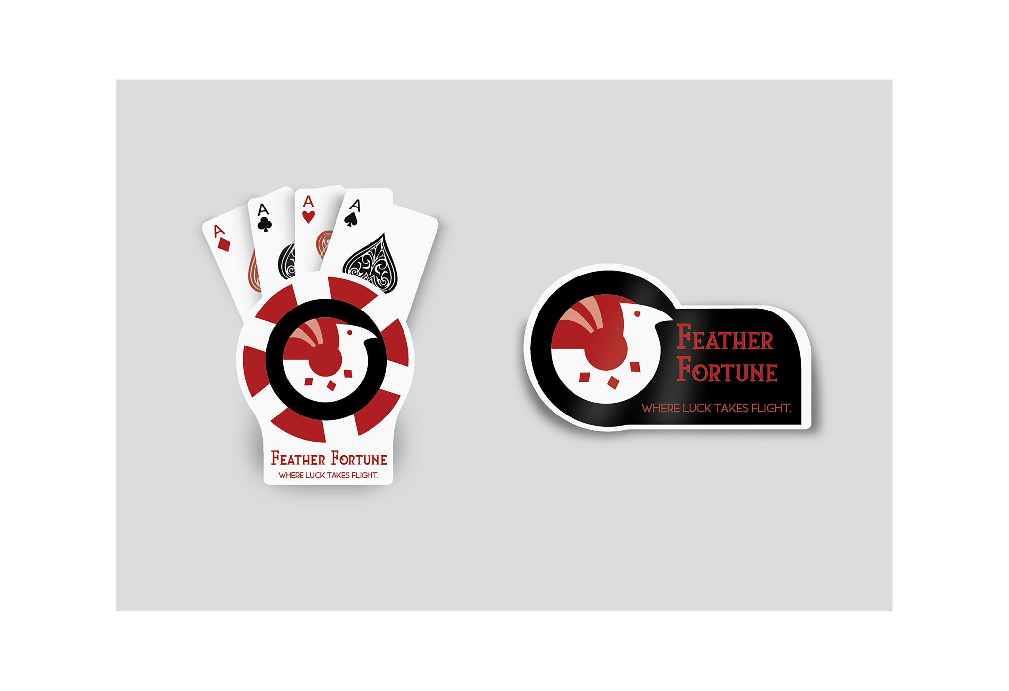
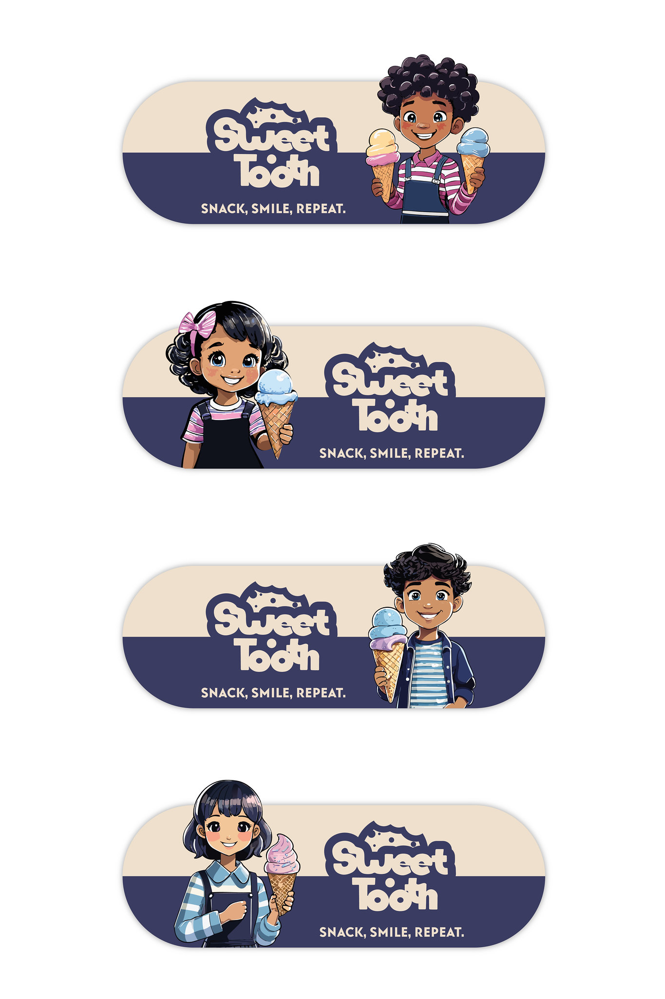
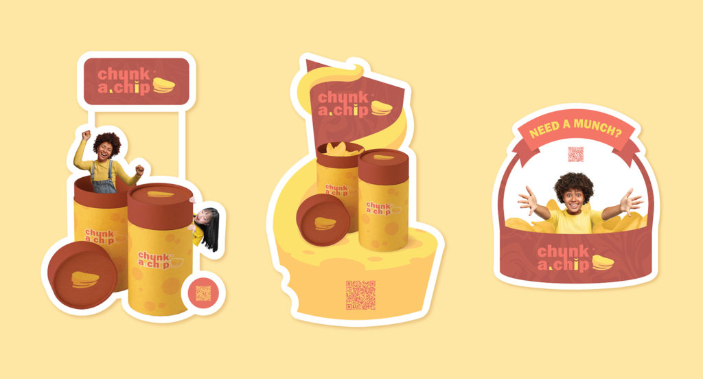
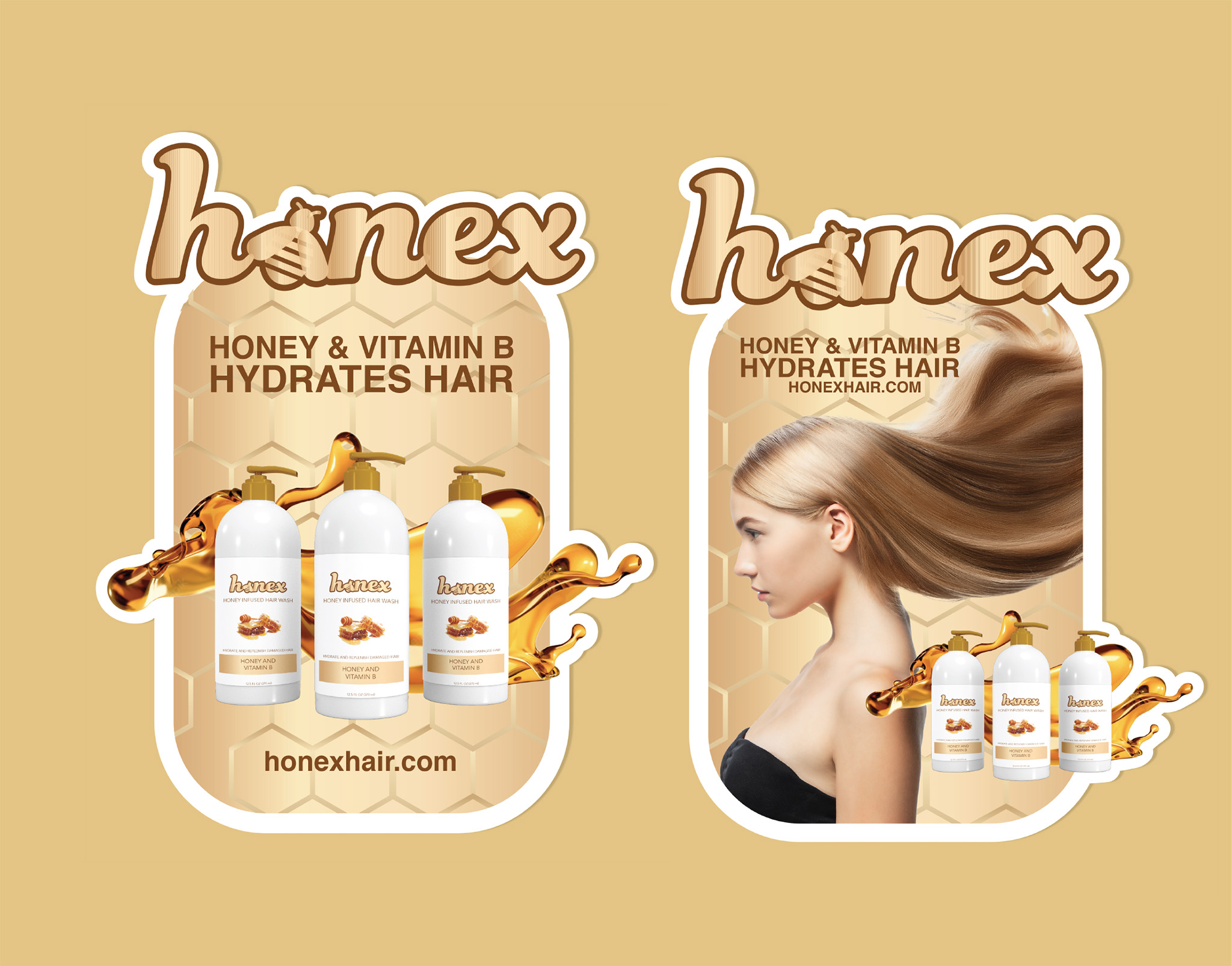
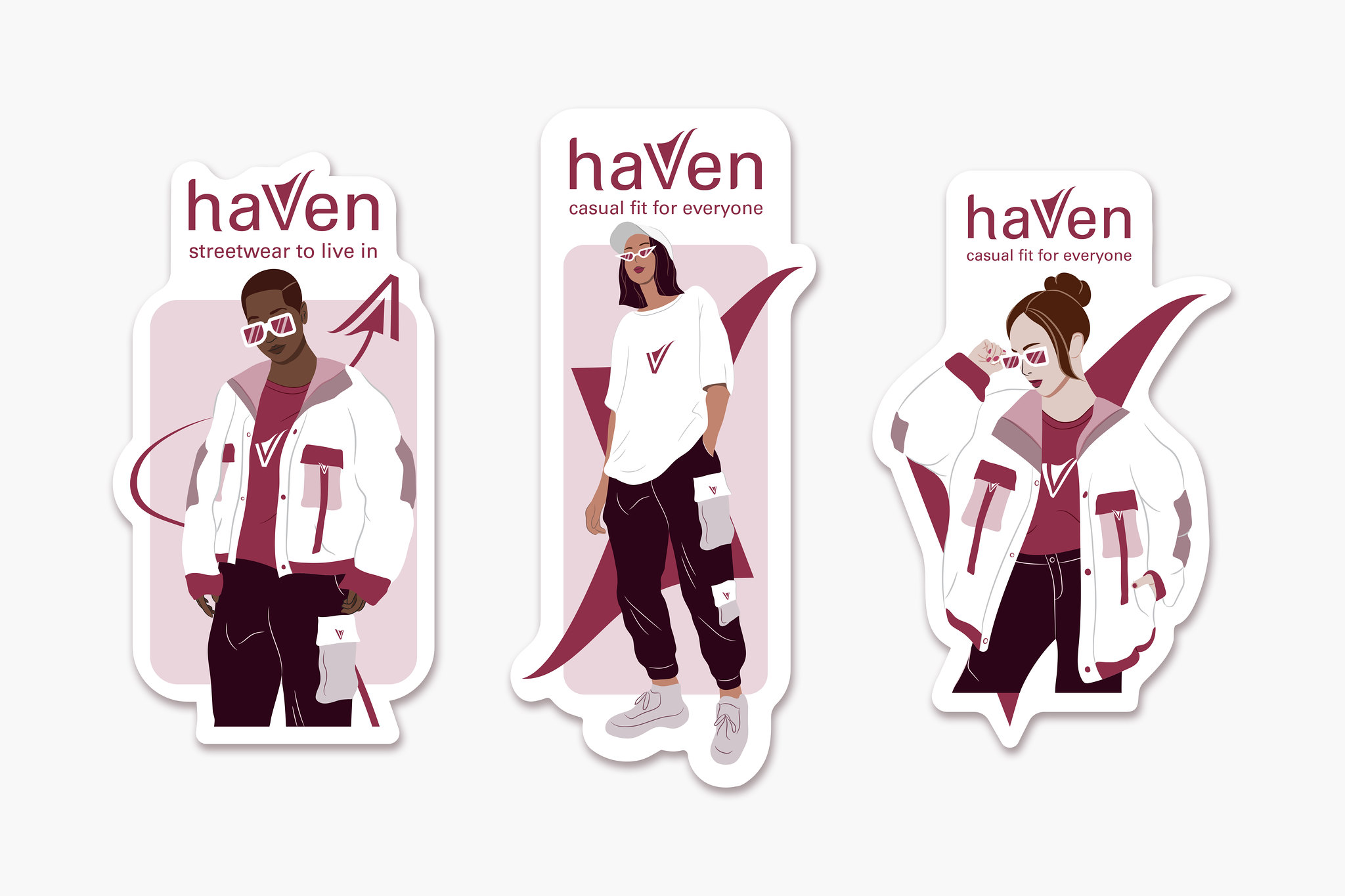
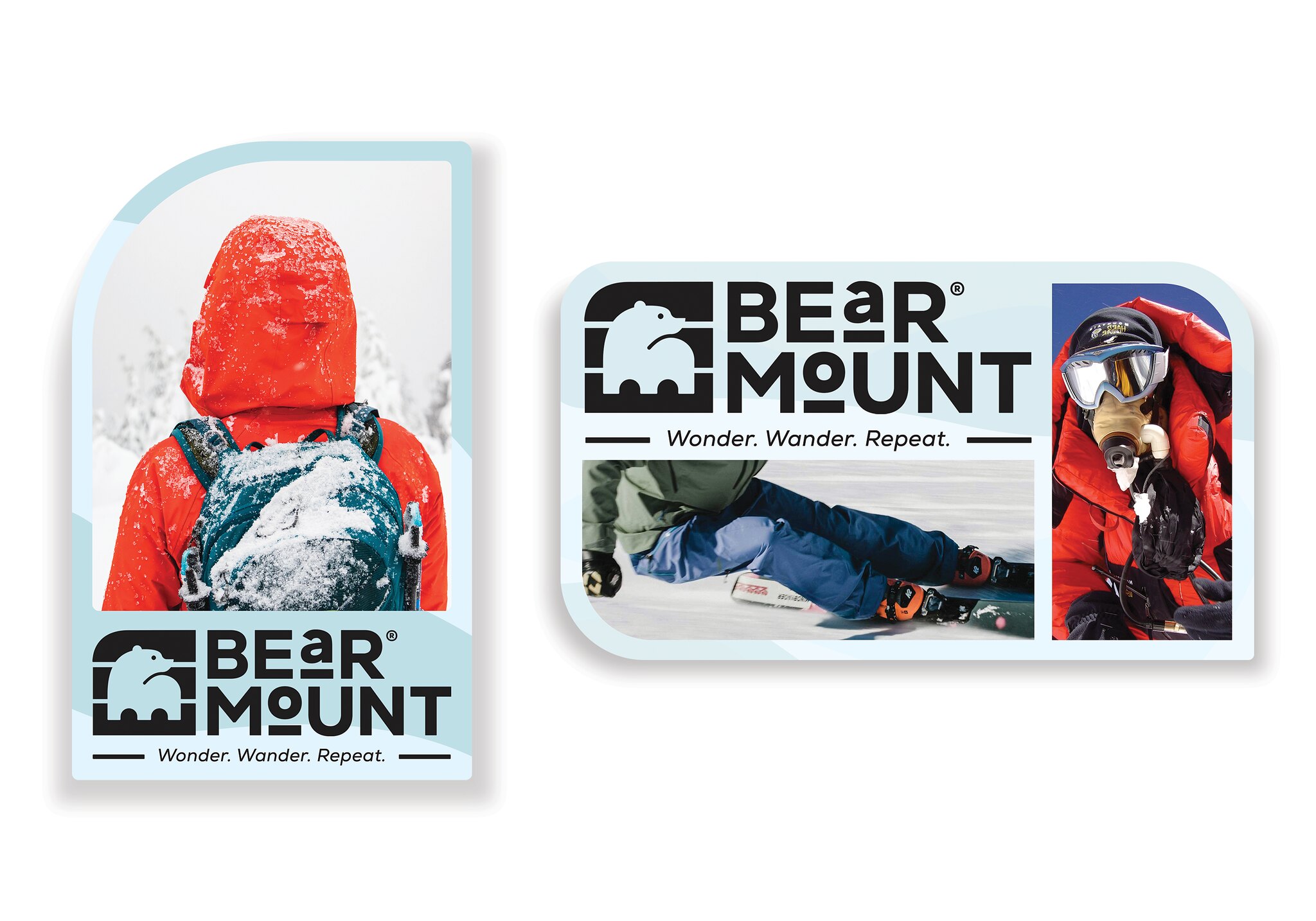
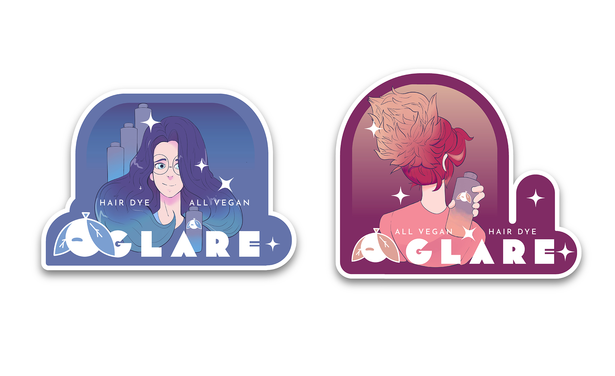
POP Design – Featured Student Work from ARTS-4334 | Spring 2024 – Summer 2025
Regarding the student who created each work below, please find their name in the Flickr group via the link below:
https://flickr.com/groups/pxstudio_advertising-design/


POP Design – Previous Student Work from ARTS-4334 | Fall 2022 – Fall 2023

Alma Morales
Adrian Ortega
Juan Sarmiento
Logo Design Using AI
- https://logo.com/
- https://fiverr.com
- https://looka.com/
- https://www.logoai.com/
- https://designs.ai/logomaker
- https://smashinglogo.com/en/
- https://www.tailorbrands.com
AI Design Rules for Logo Designs:
Refine, Simplify, and Humanize AI-Generated Logos.
If you choose to use AI in your logo design process, follow these principles to ensure both quality and originality. You may use AI for idea generation and design execution for one logo only.
- Refine Composition – Use AI-generated layouts as a foundation, but adjust proportions, alignment, and spacing for better visual balance. AI may create inconsistent structures that require manual refinement.
- Simplify Forms – Remove unnecessary details or excessive complexity to improve clarity and versatility. Focus on strong, recognizable shapes that work across different applications.
- Improve Typography – AI-generated fonts may lack brand personality. Customize letterforms, adjust kerning, and ensure the typeface aligns with the brand’s identity while maintaining readability.
- Enhance Symbolism – AI may generate abstract or generic visuals. Modify icons and graphic elements to reinforce cultural relevance, industry alignment, and meaningful storytelling.
- Optimize for Application – Test redesigned logos across different mediums (print, web, social media) to ensure scalability, contrast, and adaptability. AI designs may not always be functional in every context.
- Humanize the Aesthetic – Introduce hand-crafted elements, organic imperfections, or unique artistic choices to counteract the mechanical feel of AI-generated designs. A strong logo should evoke emotion and connection.
Note: AI-generated logos must be refined or retouched before submission; unedited versions will not be accepted.
How to Address Colors for a Brand Identity (Color Choice)
- CMYK – Process Color (4 Colors, Full Colors)
https://www.rapidtables.com/web/color/RGB_Color.html – Screen Colors - Hex Colors – Web Colors | https://htmlcolorcodes.com/color-chart/web-safe-color-chart/
- PMS Colors – Pantone Matching System (C & U)
Learn the difference between spot color and process color.
https://www.adobe.com/creativecloud/design/discover/spot-vs-process-color.html
When crafting your color palette for your brand identity campaign, take into account the following factors. By doing so, you’ll develop a color scheme that not only aptly represents your brand but also connects authentically with your target audience. By considering these elements, you’ll create a color palette that strengthens your brand’s identity and fosters a meaningful connection with your audience.
- Brand Personality:
- Reflect the personality and values of your brand. Choose colors that align with the emotions and traits you want to convey.
- Target Audience:
- Understand your target audience and their preferences. Choose colors that resonate with your demographic.
- Industry Standards:
- Be aware of industry color trends and standards. Stand out while still fitting within the expectations of your market.
- Versatility:
- Ensure that the chosen colors are versatile and work well across various mediums, such as digital, print, and merchandise.
- Brand Differentiation:
- Consider the colors used by competitors and aim for a unique and distinctive color palette that helps your brand stand out.
- Cultural Sensitivity:
- Be mindful of cultural connotations associated with colors, as meanings can vary across different regions and communities.
- Accessibility:
- Ensure your color choices are accessible to individuals with visual impairments. High contrast and legibility are crucial for a wider audience.
- Consistency:
- Maintain consistency across your brand materials. Establish a cohesive color scheme that reinforces brand recognition.
- Adaptability:
- Consider how the colors will appear in various contexts and backgrounds. Ensure they maintain their effectiveness and legibility in different situations.
- Longevity:
- Select timeless colors that will stay relevant as your brand evolves.
PMS Colors for Branding Design
PMS (Pantone Matching System) colors play a crucial role in branding because they ensure color consistency across different materials and mediums. Unlike CMYK or RGB, which can vary due to different printers, screens, or lighting conditions, PMS colors are pre-mixed, standardized inks that deliver precise, repeatable hues.
Key Reasons for PMS in Branding
- Brand Consistency – Ensures a company’s colors appear identical across all printed materials, from business cards to packaging.
- Uniqueness & Recognition – Many global brands, like Coca-Cola (PMS 484) and Tiffany & Co. (PMS 1837), have custom PMS colors that are legally protected as part of their identity.
- Cost Efficiency in Printing – For large-scale production, using PMS instead of CMYK can reduce costs while maintaining exact colors.
- Emotional & Psychological Impact – Specific colors evoke emotions and reinforce brand perception (e.g., red for excitement, blue for trust).
See the World in Color
I recommend you to use color of the year of Pantone for creating your branding posters if it is applicable.
https://www.pantone.com/color-of-the-year/2024
https://www.pantone.com/color-of-the-year/2023?srsltid=AfmBOoo3YzYUXW4ORvjz6UQrrhxxJBArujCOgrGoYnE0jxim6mUzraNF
https://vimeo.com/search?q=the%20Pantone%20Color%20of%20the%20Year%202023
https://www.pantone.com/articles/color-of-the-year/color-of-the-year-2020
Logo Design – Specification Guidelines
https://logotype.dev/articles/complete-guide-to-logo-specifications