Making The Most Of Visual Language
Verbal language is often used to inspire and shape design and typography in order to get a message across, with the goal being to make the most of the viewer’s reaction. Carefully mixing a design’s implication with literal meaning can lead to a memorable outcome. The following designs are great examples of the effects that can be achieved by employing verbal language that has helped to inspire a visual treatment.
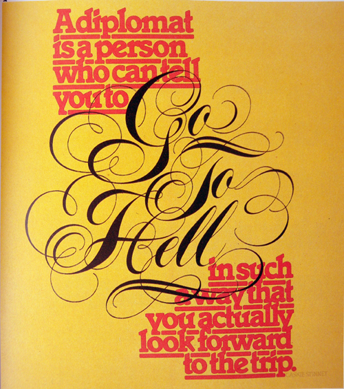
Our illustration is taken from the work of renowned American graphic designer Herb Lubalin, who was described in a monograph about him by Gertrude Snyder and Alan Peckolick as being
“a tenacious typographer, whose graphic concept employed copy, art and typography, and he used available production methods to underline the drama inherent in the message. Idea preceded design.”
Given the subject of this article, this quote is especially fitting. It shows Lubalin as a designer who valued the combined communicative power of language, typography and composition. The book goes on to explain that he used production methods not just for effect but also as a way to emphasize the meaning and message of a project. In Lubalin’s time, these decisions would have entailed manual labor, posing greater limitations than we face today. Finally, this quote confirms that, for Lubalin, concept was of paramount importance and always came before design.
Image: Peter Gabor
Given the subject of this article, this quote is especially fitting. It shows Lubalin as a designer who valued the combined communicative power of language, typography and composition. The book goes on to explain that he used production methods not just for effect but also as a way to emphasize the meaning and message of a project. In Lubalin’s time, these decisions would have entailed manual labor, posing greater limitations than we face today. Finally, this quote confirms that, for Lubalin, concept was of paramount importance and always came before design.
Typography is used to communicate tone of voice, personality, age, gender and mood, and it can be easily manipulated. If, instead of this script font that so successfully represents the personality, we used a slab serif, suddenly the character changes, as does the emotional impact of the statement. It’s a great example of how quickly the tone can shift with a simple change of typeface.
Using delicate and well-considered composition of typographic detailing, Lubalin has succeeded in making an unpleasant message seem attractive and pleasing. The focal point of this statement, being told to
“go to hell”
is shown in an elaborate and elegant calligraphic form, enabling this mildly offensive statement to be mistaken for something that could be looked forward to with great anticipation at first sight.
“A diplomat is a person who can tell you to go to hell in such a way that you actually look forward to the trip.”